—
The First Ward
The First Ward
The First Ward
BRANDING FOR HAIR SALON IN TULSA, OK
BRANDING FOR HAIR SALON IN TULSA, OK
BRANDING FOR HAIR SALON IN TULSA, OK
Branding designed to honor the rich history of the salon’s space and the city of Tulsa
Branding designed to honor the rich history of the salon’s space and the city of Tulsa
Branding designed to honor the rich history of the salon’s space and the city of Tulsa

ROLE
ROLE
ROLE
Branding
Logo Design
Identity Design
Marketing Materials
Branding
Logo Design
Identity Design
Marketing Materials
Branding
Logo Design
Identity Design
Marketing Materials
FREELANCE CLIENT
2013
FREELANCE CLIENT
2013
FREELANCE CLIENT
2013
Opening a new salon
Opening a new salon
Opening a new salon
PROJECT BACKGROUND
PROJECT BACKGROUND
PROJECT BACKGROUND
After living in New York City as a successful hairstylist for several years, Jessica Bond moved back to her home town of Tusla, OK, to open her own salon. She found the perfect space located in the popular Blue Dome District and hired the architecture firm Workstead to design the interior space. I worked with Jessica and Workstead to create a brand identity complementary to the rich history of the salon’s space and Jessica’s vision for a “welcoming oasis in the middle of the city.”
After living in New York City as a successful hairstylist for several years, Jessica Bond moved back to her home town of Tusla, OK, to open her own salon. She found the perfect space located in the popular Blue Dome District and hired the architecture firm Workstead to design the interior space. I worked with Jessica and Workstead to create a brand identity complementary to the rich history of the salon’s space and Jessica’s vision for a “welcoming oasis in the middle of the city.”
After living in New York City as a successful hairstylist for several years, Jessica Bond moved back to her home town of Tusla, OK, to open her own salon. She found the perfect space located in the popular Blue Dome District and hired the architecture firm Workstead to design the interior space.
I worked with Jessica and Workstead to create a brand identity complementary to the rich history of the salon’s space and Jessica’s vision for a “welcoming oasis in the middle of the city.”
—
Inspiration
—
Inspiration
—
Inspiration
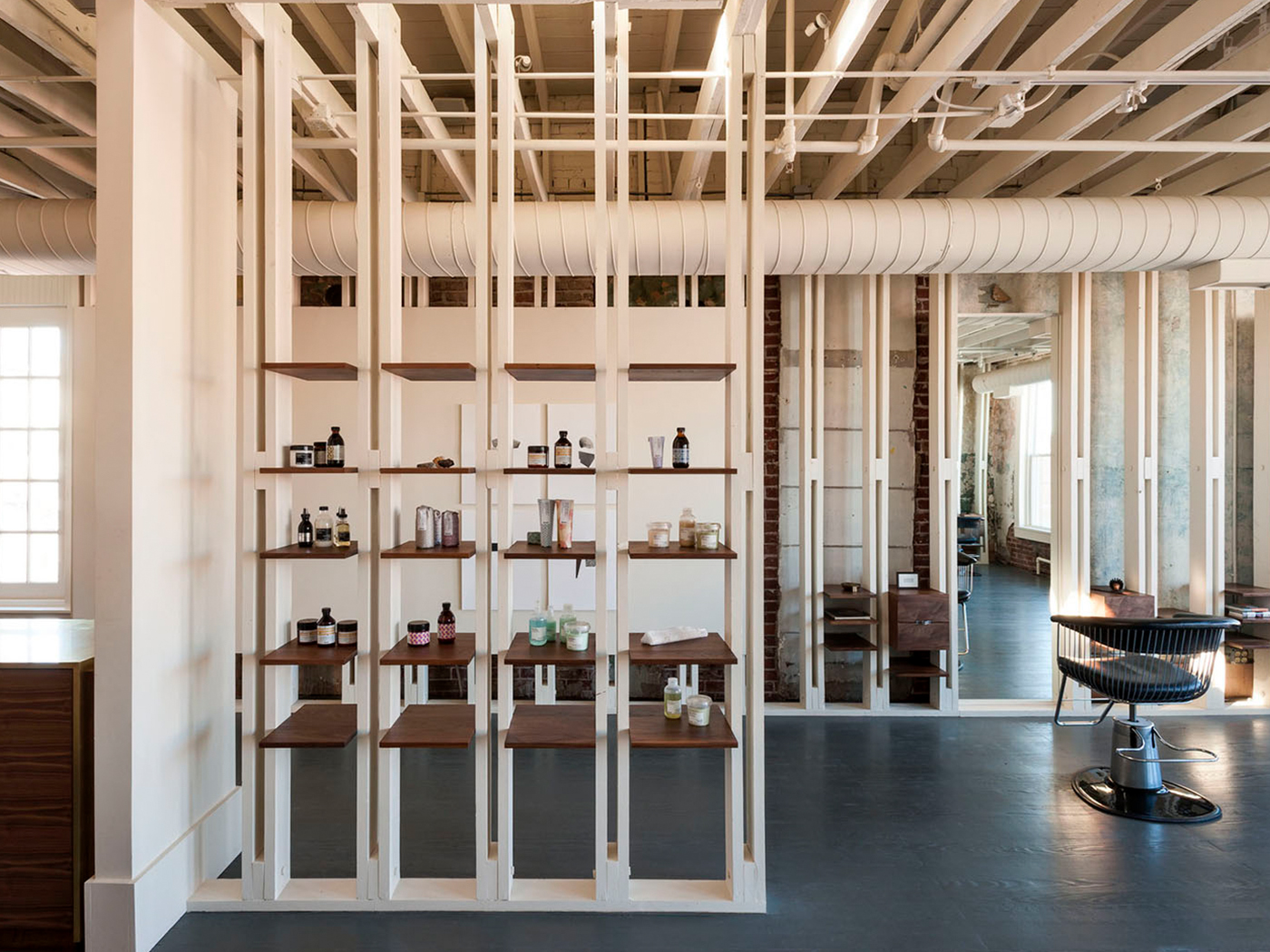
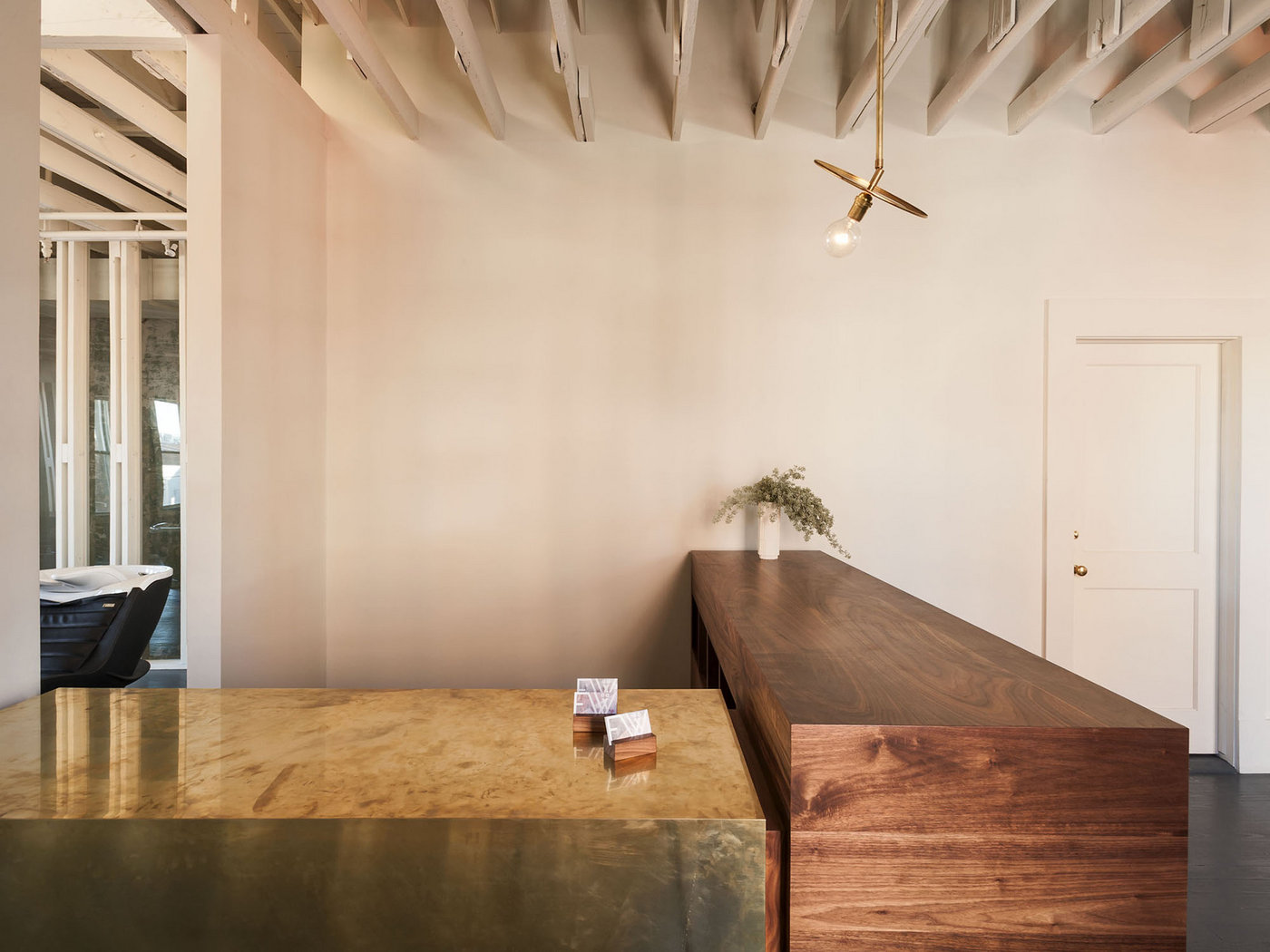
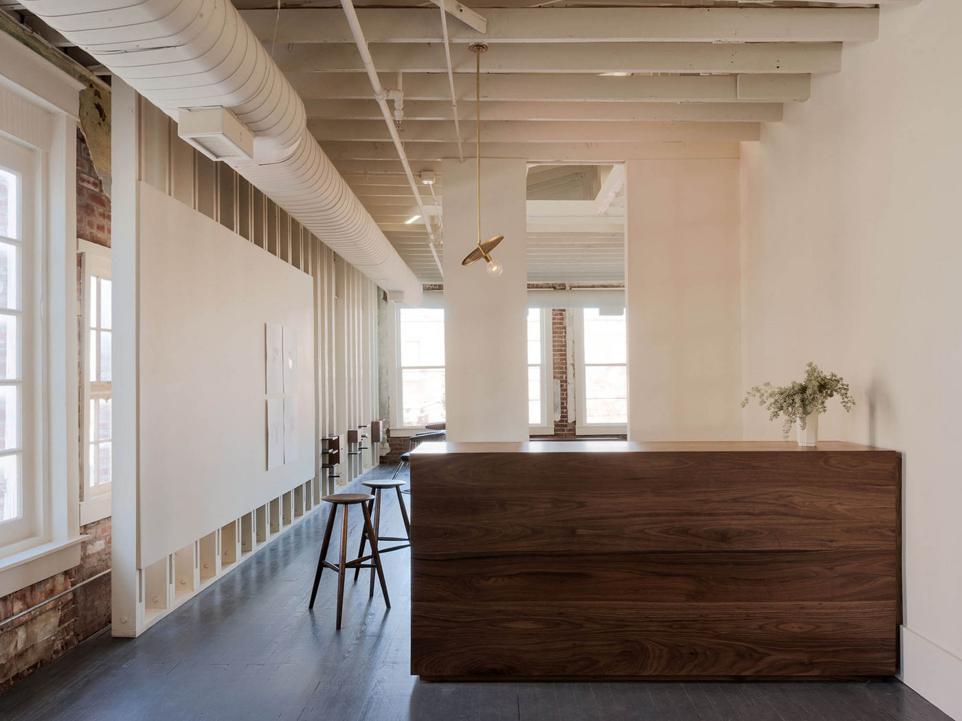
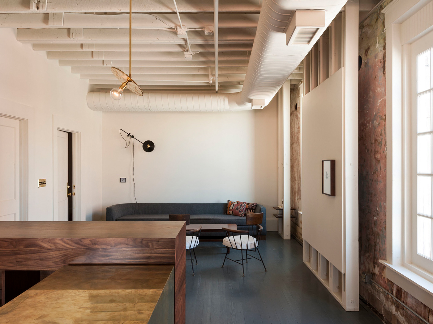
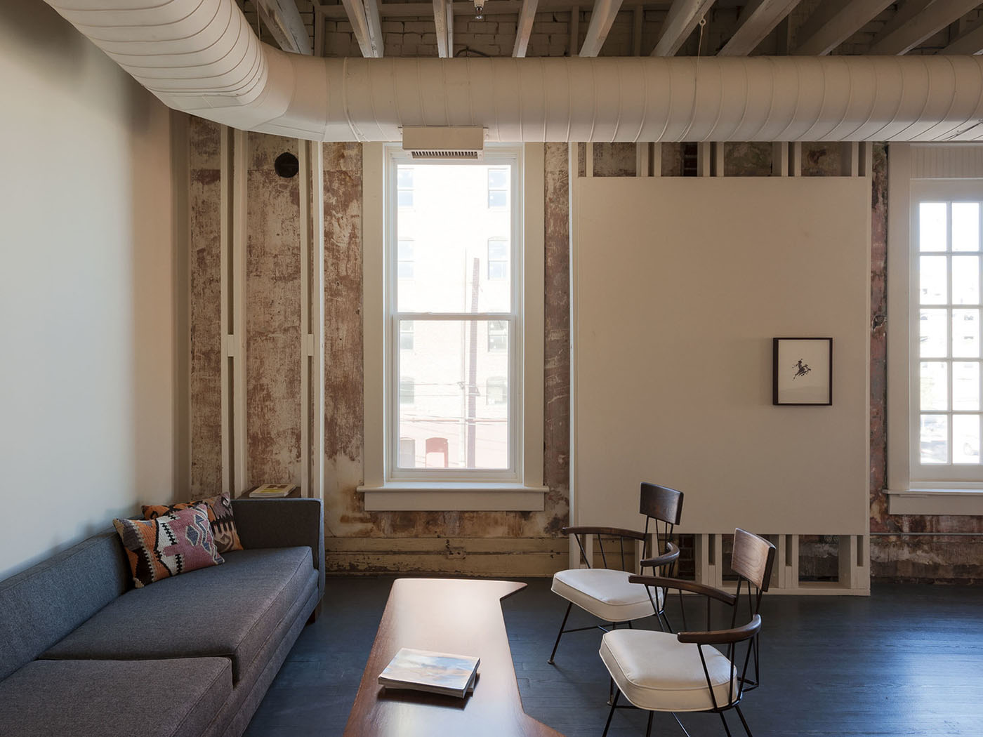
INTERIOR SPACE DESIGNED BY WORKSTEAD
INTERIOR SPACE DESIGNED BY WORKSTEAD
INTERIOR SPACE DESIGNED BY WORKSTEAD
Workstead preserved the beautiful state of decay on the walls.
Workstead preserved the beautiful state of decay on the walls.
Workstead preserved the beautiful state of decay on the walls.
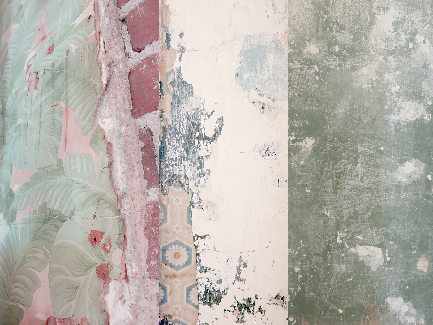
The salon is located in an old brothel
Rich with history, Workstead preserved the existing state of the walls. Wallpaper, plaster, and painted brick dating from the days of the brothel are viewed sequentially through a white wooden framework, connecting past and present.
Internal Information:
As this is a hypothetical project, I had to make a few assumptions. Significant assumptions being that time travel is expensive and that Zeit offers many kinds of travel experiences suited to different interests, activity levels, and travel preferences.
Market Research & Competitive Analysis:
I identified trends and travel preferences by gathering qualitative research. I also reviewed existing travel booking sites identifying common patterns, solutions, and potential improvements.
Focus Group:
To understand viewpoints on time travel and travel in general, I conducted an hour-long focus group with nine participants; four males, five females, ages 23–71, from different generations, varying income levels, and travel experiences.
1:1 Interviews & Contextual Inquiry:
I targeted three specific demographics for hour-long 1:1 interviews to better gain empathy on their subsequent needs and preferences. Lastly, I had participants walk me through a competitor’s website (on varying devices) while going through the process of finding and booking a trip.

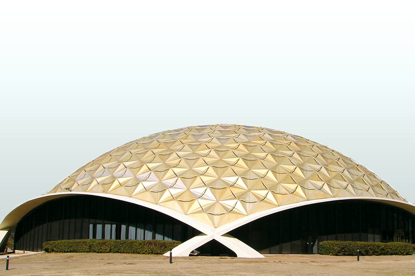
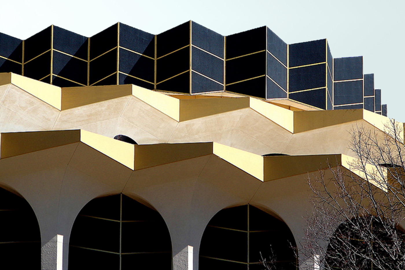
TULSA ARCHITECTURE
TULSA ARCHITECTURE
TULSA ARCHITECTURE
Tulsa is known for the futuristic campus of Oral Roberts University.
Tulsa is known for the futuristic campus of Oral Roberts University.
Tulsa, a hotbed of Art Deco and contemporary architecture, is home to The University of Oral Roberts, a futuristic Art Deco campus built in 1963. Most of the buildings were designed by the Tulsa architect Frank Wallace, who has characterized his buildings as “sculptures.” The campus has been described as “a perfect representation of the popular modernistic architecture of the time... the set of The Jetsons” but also “shabby” and “dated, like Disney's Tomorrowland.” As a proud native of Tulsa, Jessica admires the campus’s kitschy look.
Imagine time travel has been safely tested for a decade. Zeit, a new subsidiary of Richard Branson’s Virgin empire, is now offering highly curated time travel tours to the public. With 289 destinations from prehistoric times until today, Zeit needs an e-commerce site for visitors to find and reserve trips.


—
Branding
—
Branding
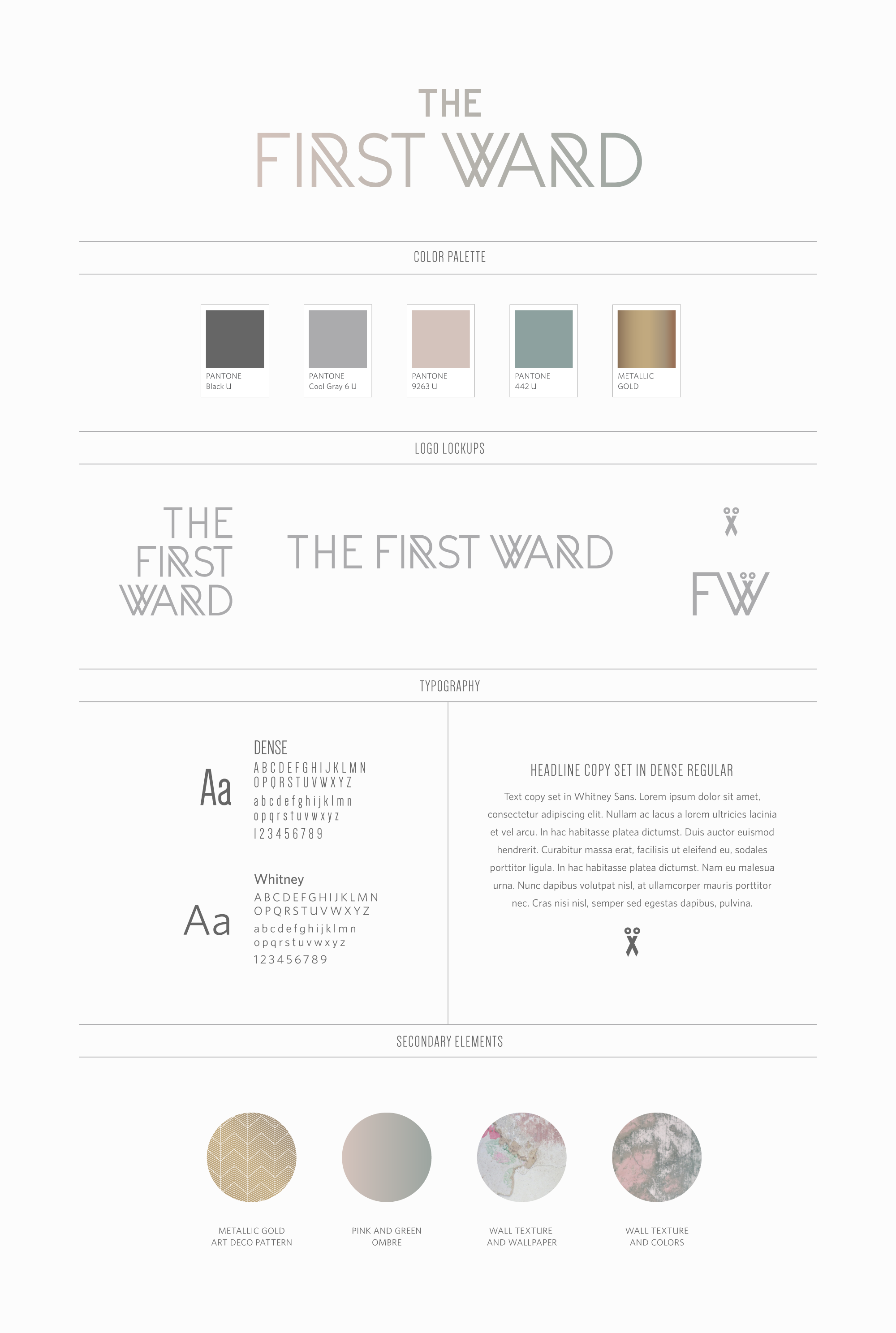
BRAND ATTRIBUTES
BRAND ATTRIBUTES
BRAND ATTRIBUTES
The First Ward is modern vintage, creative, upscale, yet casual and fun.
The First Ward is modern vintage, creative, upscale, yet casual and fun.
Bringing the inspiration together
The First Ward is a high-end salon, but it’s also a place for friends to meet and hang out in a creative space. While Jessica wanted the logo and collateral design to reflect the upscale environment, she also wanted an added sense of fun so as not to look too pretentious or serious, much like the campus of Oral Roberts.
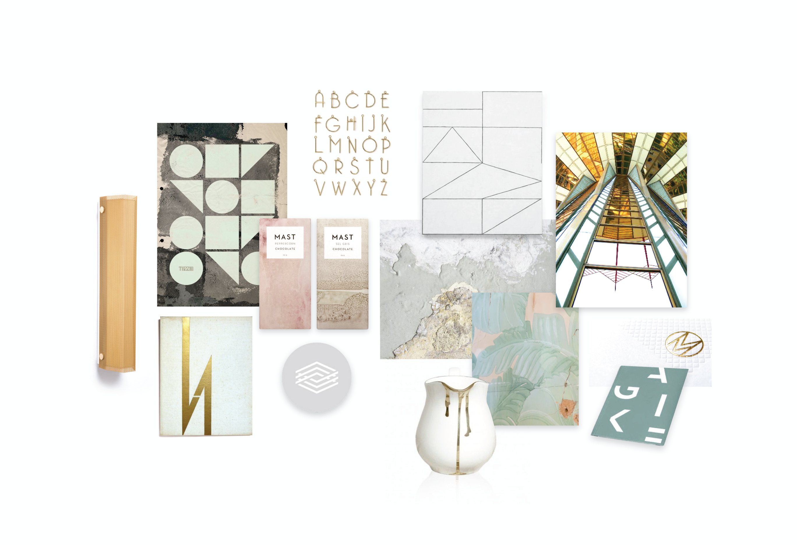
The moodboard explores a variety of layers and textures, graphical shapes, and linear typographical “frameworks.” The color palette is inspired by the remnants of old wallpaper and paint colors spotted throughout the space. Metallic gold, also peppered throughout the space in fixtures, is reminiscent of the futuristic materials used on the Oral Roberts University buildings.
MOODBOARD
MOODBOARD
MOODBOARD
BRAND IDENTITY
BRAND IDENTITY
BRAND IDENTITY
—
Collateral
—
Collateral
DESIGN
DESIGN
DESIGN
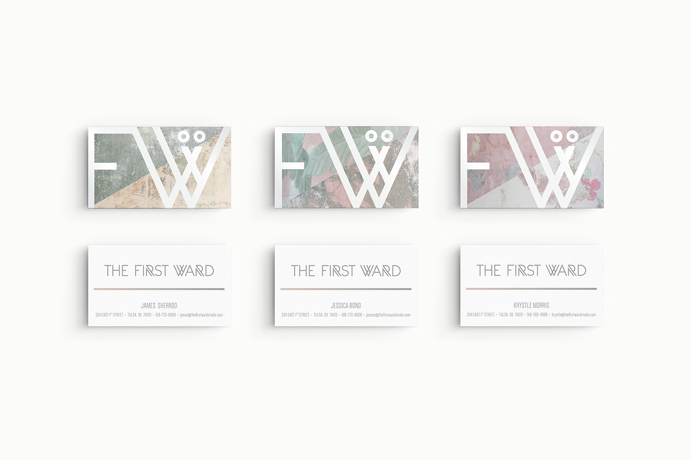
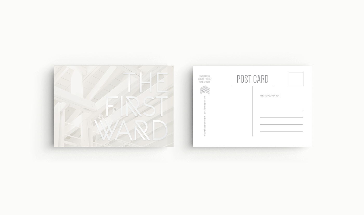
Much like the interior structure, the logo acts as a white framework layered over images.
Much like the interior structure, the logo acts as a white framework layered over images.
Textures and layering
The logo is glossy white sitting atop images of the wall texture and wallpaper. Different wallpaper patterns on the business cards were chosen to represent different employee personalities.
Soft muted pink and green
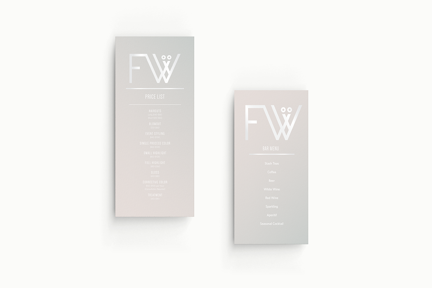
Other collateral pieces, such a the price list and bar menu, bring a sense of minimal calm with muted gradient colors behind the glossy white logo.
Metallic gold and art deco pattern
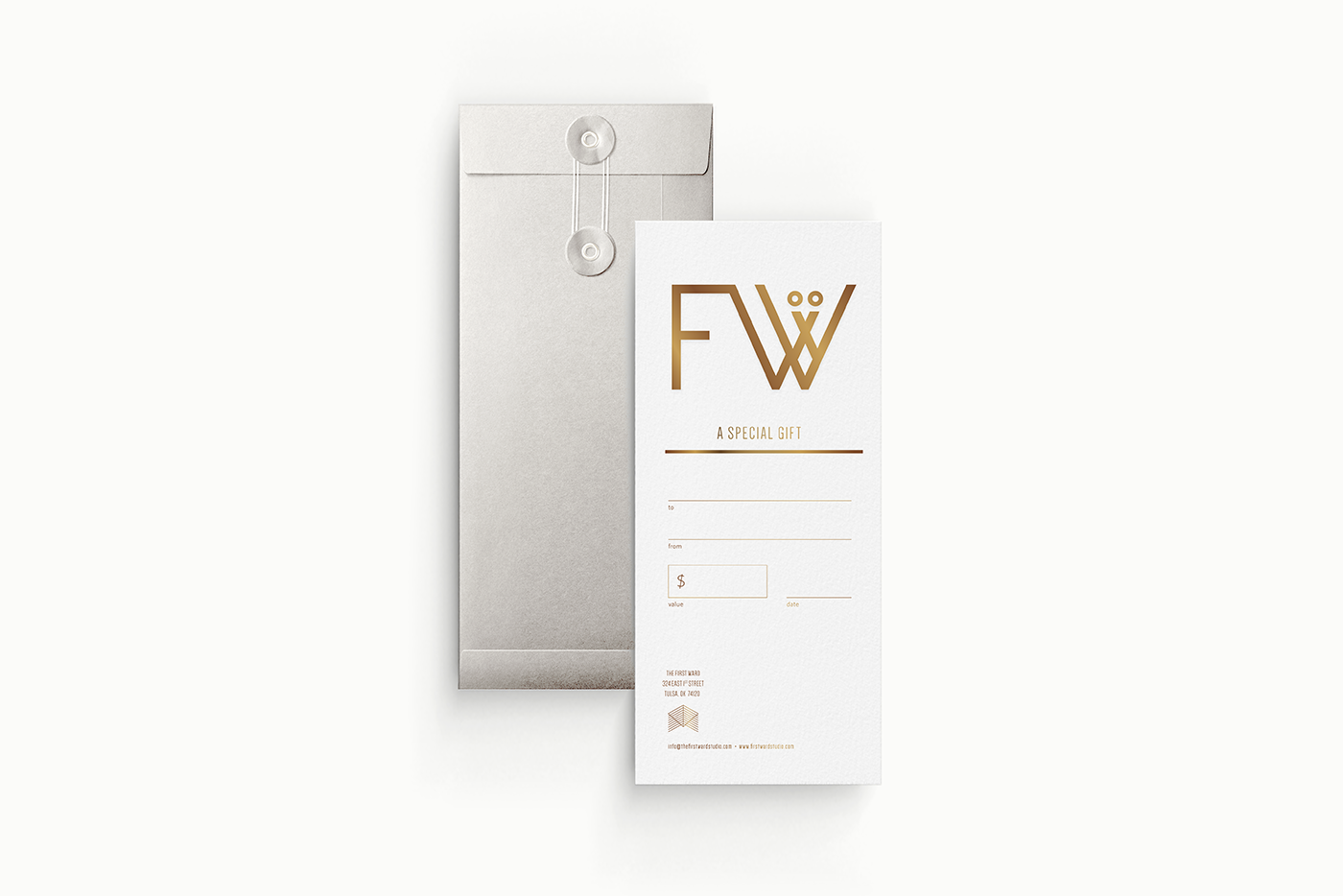
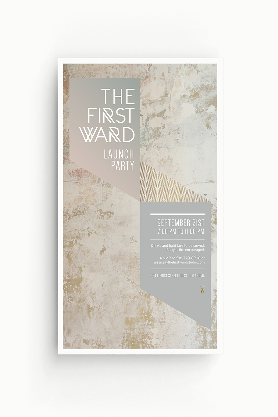
The gift certificate card has metallic gold foil atop a thick, uncoated paper. The launch poster has a white art deco pattern inspired by the interior space’s white framework and Oral Robert’s prayer tower.
Textures and layering
The logo is glossy white sitting atop images of the wall texture and wallpaper. Different wallpaper patterns on the business cards were chosen to represent different employee personalities.
Soft muted pink and green
Other collateral pieces, such a the price list and bar menu, bring a sense of minimal calm with muted gradient colors behind the glossy white logo.
Metallic gold and art deco pattern
The gift certificate card has metallic gold foil atop a thick, uncoated paper. The launch poster has a white art deco pattern inspired by the interior space’s white framework and Oral Robert’s prayer tower.
BUSINESS CARDS
BUSINESS CARDS
BUSINESS CARDS
POSTCARD
POSTCARD
POSTCARD
SALON PRICE LIST AND BAR MENU
SALON PRICE LIST AND BAR MENU
SALON PRICE LIST AND BAR MENU
GIFT CERTIFICATE
GIFT CERTIFICATE
GIFT CERTIFICATE
LAUNCH POSTER
LAUNCH POSTER
LAUNCH POSTER
TESTIMONIAL FROM THE FIRST WARD
TESTIMONIAL FROM THE SALON OWNER
“Elizabeth delivered an incredible design package that covered everything we needed for our company branding, business cards, marketing materials, etc. She was able to interpret our vision in a way that was organic and classic, yet still very innovative and modern.
Five years later, we still receive compliments daily. Elizabeth went above and beyond all expectations and was a complete pleasure to work with. I highly recommend her and look forward to working with Elizabeth again!”
— Jessica Bond, Owner, Operations and Programming at The First Ward
“Elizabeth delivered an incredible design package that covered everything we needed for our company branding, business cards, marketing materials, etc. She was able to interpret our vision in a way that was organic and classic, yet still very innovative and modern.
Five years later, we still receive compliments daily. Elizabeth went above and beyond all expectations and was a complete pleasure to work with. I highly recommend her and look forward to working with Elizabeth again!”
— Jessica Bond
Coming soon:
GOOGLE MAPS FEATURE
YARD COMMUNITY APP
© 2020 ELIZABETH LINDE