—
St. Joseph Montessori School
St. Joseph Montessori School
St. Joseph Montessori School
UX/UI & BRANDING REFRESH FOR SCHOOL WEBSITE
UX/UI & BRANDING REFRESH FOR SCHOOL WEBSITE
UX/UI & BRANDING REFRESH FOR SCHOOL WEBSITE
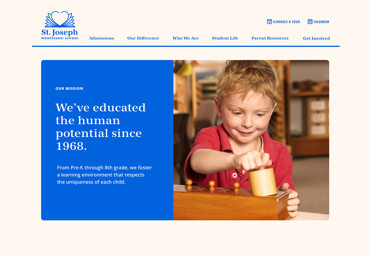
Refreshing a Montessori school’s website to better meet the needs of parents and the school
Refreshing a Montessori school’s website to better meet the needs of parents and the school
Refreshing a Montessori school’s website to better meet the needs of parents and the school
ROLE
ROLE
ROLE
Research & Analysis
Information Architecture
Content Strategy
Branding Refresh
User Interface Design
Prototyping & User Testing
Research & Analysis
Information Architecture
Content Strategy
Branding Refresh
User Interface Design
Prototyping & User Testing
Research & Analysis
Information Architecture
Content Strategy
Branding Refresh
User Interface Design
Prototyping & User Testing
Research & Analysis
Information Architecture
Content Strategy
Branding Refresh
User Interface Design
Prototyping & User Testing
ST. JOSEPH MONTESSORI SCHOOL
ST. JOSEPH MONTESSORI SCHOOL
ST. JOSEPH MONTESSORI SCHOOL
PROPOSED DESIGN
WINTER 2019
PROPOSED DESIGN
WINTER 2019
PROPOSED DESIGN
WINTER 2019
What is Montessori?
What is Montessori?
What is Montessori?
MONTESSORI BACKGROUND
MONTESSORI BACKGROUND
MONTESSORI BACKGROUND
Dr. Maria Montessori’s educational methods have transformed schools around the globe for more than a century. Her child-focused approach builds on the way children learn naturally, respects individual differences between children, and develops the whole child academically, socially, and emotionally.
Dr. Maria Montessori’s educational methods have transformed schools around the globe for more than a century. Her child-focused approach builds on the way children learn naturally, respects individual differences between children, and develops the whole child academically, socially, and emotionally.
Dr. Maria Montessori’s educational methods have transformed schools around the globe for more than a century. Her child-focused approach builds on the way children learn naturally, respects individual differences between children, and develops the whole child academically, socially, and emotionally.
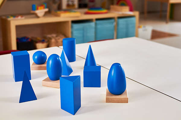
Montessori classrooms are immediately recognizable. In scientifically prepared environments, often with specially designed Montessorian materials, children choose activities according to their interests and abilities.
Montessori classrooms are immediately recognizable. In scientifically prepared environments, often with specially designed Montessorian materials, children choose activities according to their interests and abilities.
Montessori classrooms are immediately recognizable. In scientifically prepared environments, often with specially designed Montessorian materials, children choose activities according to their interests and abilities.

PROJECT BACKGROUND
The St. Joseph Montessori School, located in Columbus, Ohio, has been living Dr. Maria Montessori’s words, “to educate the human potential” for over 50 years. The school is supported by an involved community of people who volunteer and help out in any way they can.
Because it is not within the school’s budget to afford an outside design firm, their website is maintained internally by a small and busy staff wearing many hats. As a parent with two children attending, I offered my design services to update the school’s website and branding.
—
Research
—
Research
—
Research
INTERVIEWS
INTERVIEWS
INTERVIEWS
I met with school faculty and parents to understand the current role of the school’s website and to uncover any problems they may have.
I met with school faculty and parents to understand the current role of the school’s website and to uncover any problems they may have.
I met with school faculty and parents to understand the current role of the school’s website and to uncover any problems they may have.
Faculty & Staff Interviews to determine the school’s goals
I met with a few teachers as well as the Head of School, the Admissions Director, the Director of Development, Marketing, and Project Management, and the Office Manager.
Parent Interviews to uncover concerns
I met with two highly involved parents, one being a board member at the school and spoke to various parents over time.
Internal Information:
As this is a hypothetical project, I had to make a few assumptions. Significant assumptions being that time travel is expensive and that Zeit offers many kinds of travel experiences suited to different interests, activity levels, and travel preferences.
Market Research & Competitive Analysis:
I identified trends and travel preferences by gathering qualitative research. I also reviewed existing travel booking sites identifying common patterns, solutions, and potential improvements.
Focus Group:
To understand viewpoints on time travel and travel in general, I conducted an hour-long focus group with nine participants; four males, five females, ages 23–71, from different generations, varying income levels, and travel experiences.
1:1 Interviews & Contextual Inquiry:
I targeted three specific demographics for hour-long 1:1 interviews to better gain empathy on their subsequent needs and preferences. Lastly, I had participants walk me through a competitor’s website (on varying devices) while going through the process of finding and booking a trip.
KEY FINDINGS FROM INTERVIEWS
KEY FINDINGS FROM INTERVIEWS
Enrollment is essential, but so is the retention of current students.
Enrollment is essential, but so is the retention of current students.
There is a drop off after Kindergarten
While gaining enrollment is the primary goal of the website, the retention of current students is a concern as there is a drop off after Kindergarten.
Prospective parents are often misinformed
Prospective parents are seeking a Montessori school. Still, there can be misinformation and confusion about what Montessori means (even among current parents). Some prospective parents don’t realize the school offers education into Middle School.
Time travel interests people of all ages, as the reasons to travel are the same: to have authentic experiences and to gain new perspectives. However, age and budget greatly influence how a person vacations. With many trips to choose from, the website needs a clear and robust classification system that accounts for the distinct travel differences between generations.
Parents miss information and are not visiting the site to find it.
Parents miss information and are not visiting the site to find it.
The website is underused
The school’s website is not a source of finding information. Most parents rely on “Friday Notes,” the weekly email newsletter to keep up to date, but it is lengthy, and many skim it. There are also multiple forms of communication and it can be challenging to keep track of information.
The school calendar is the number one reason to visit the website
Many parents manually key into their calendar school events without realizing the school calendar can sync to their own.
WEBSITE AUDIT
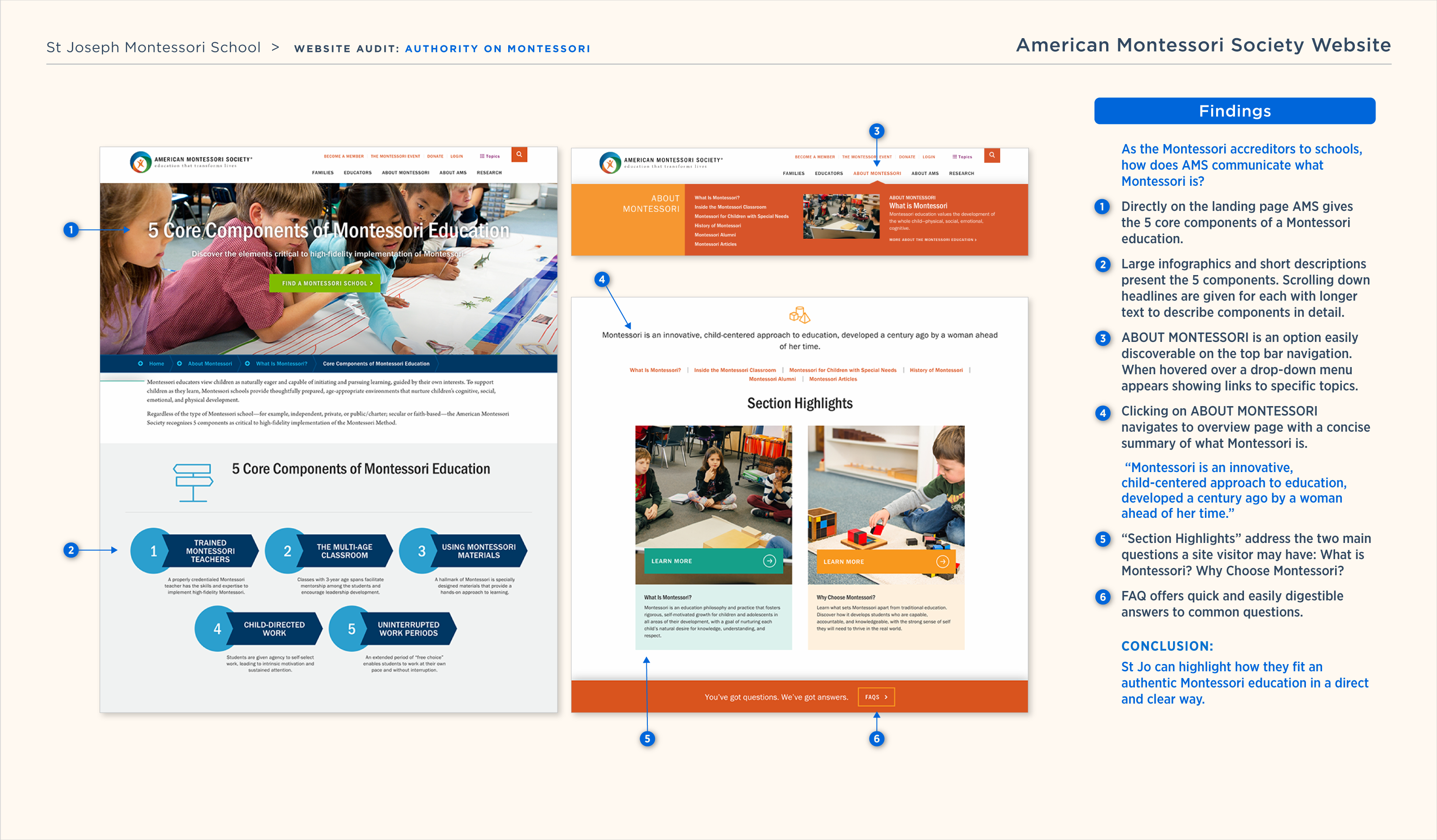
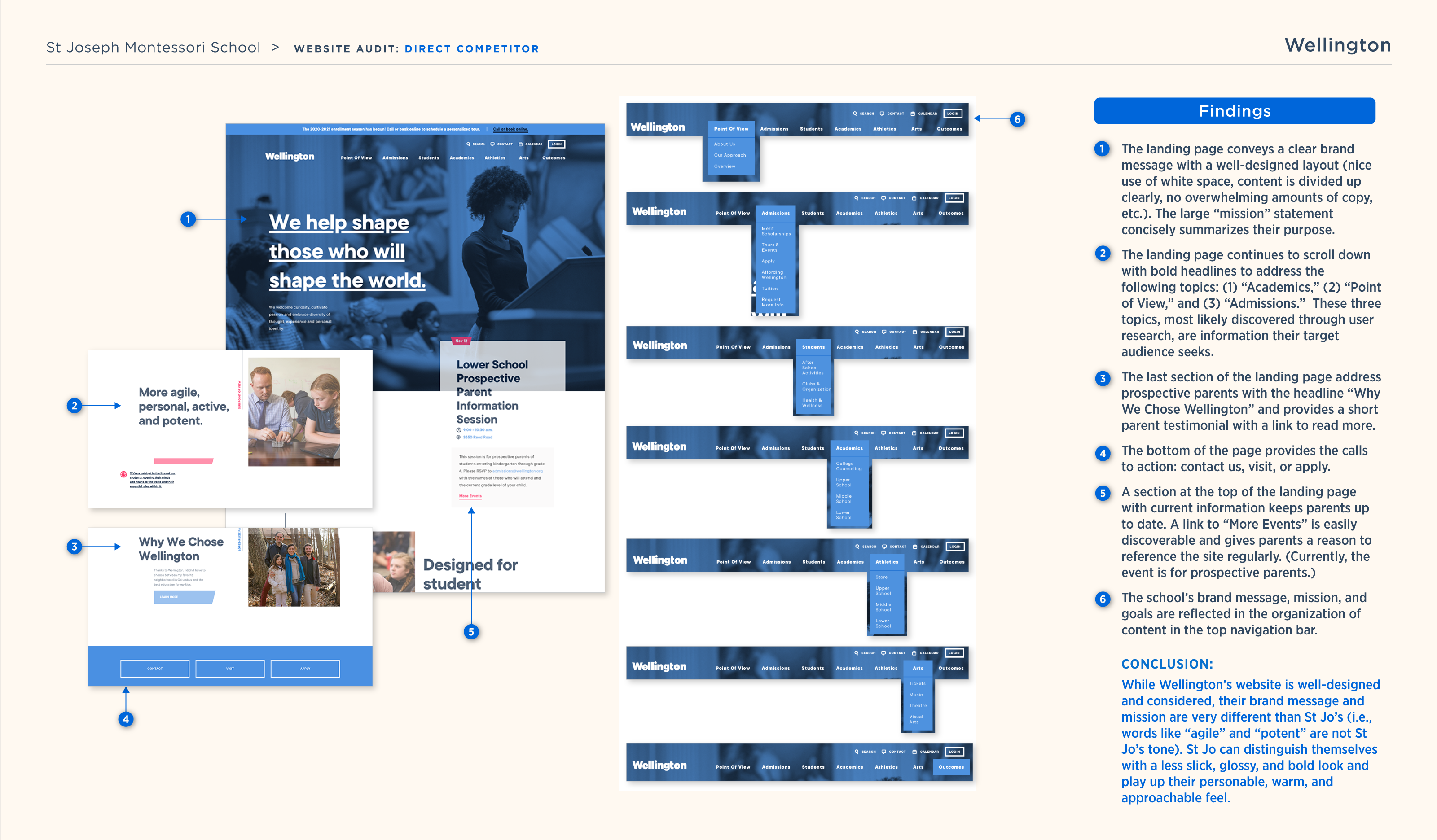
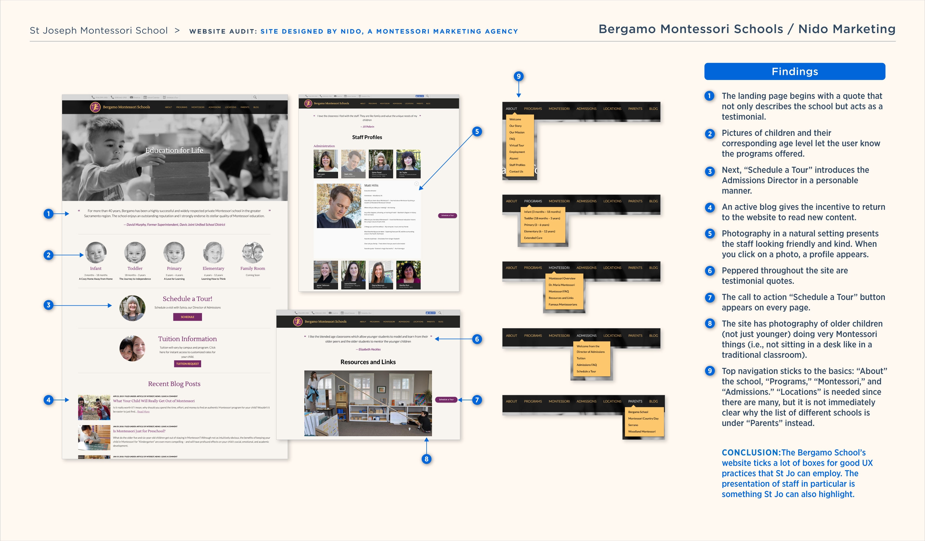
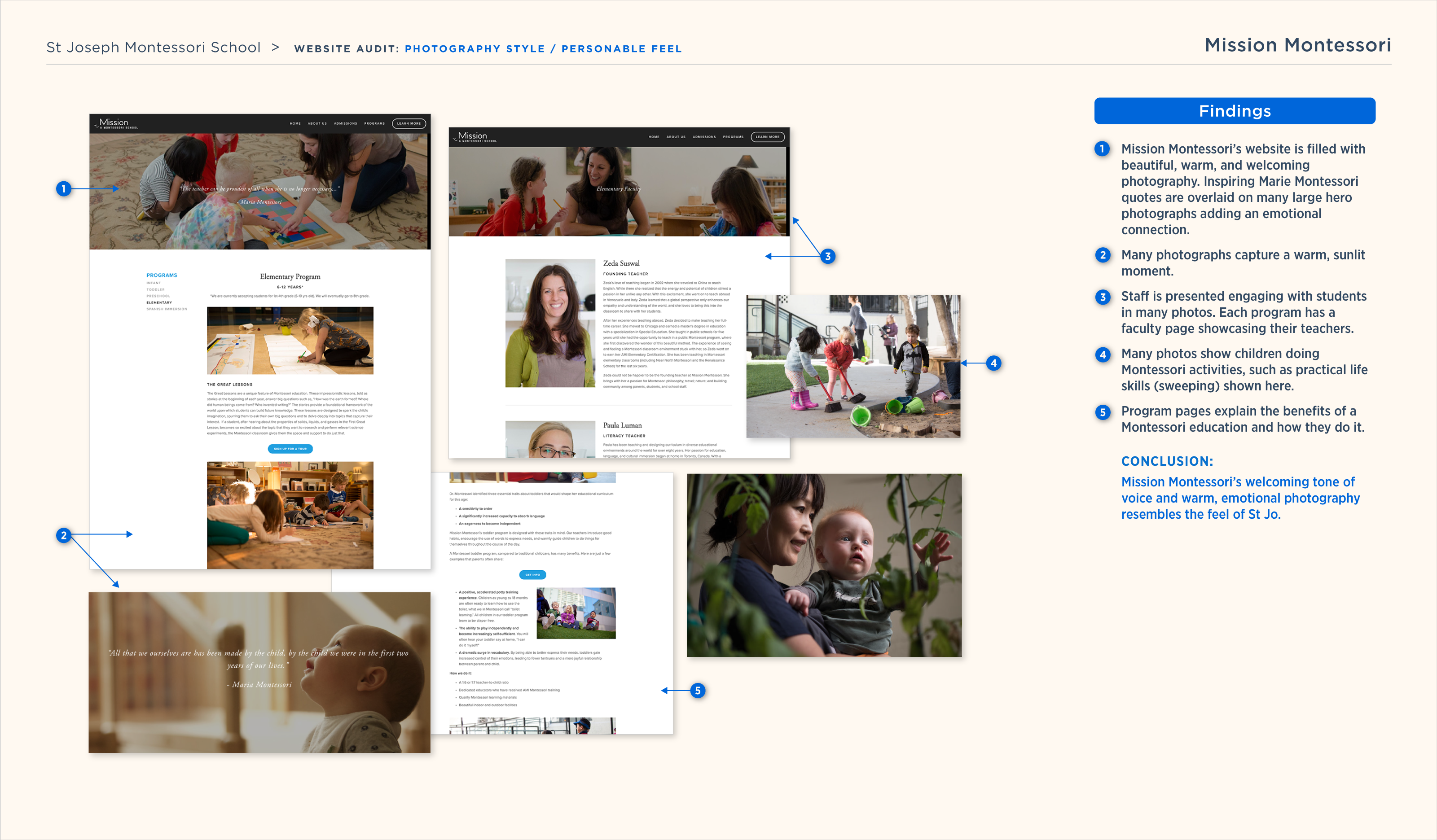
A website audit compared how different school websites function and gained insight into the presentation of a Montessori education elsewhere.
A website audit compared how different school websites function and gained insight into the presentation of a Montessori education elsewhere.
American Montessori Society
Gained insight into how Montessori is spoken of and officially presented by the American authority.
A competitive Columbus school
Analyzed a non-Montessori yet competitive school’s recently rebranded website to see how it organizes and sells itself.
Successful Montessori Websites
To determine what the school deems successful, I reviewed two Montessori school websites that are admired by the school faculty.
FINDINGS & CONCLUSIONS
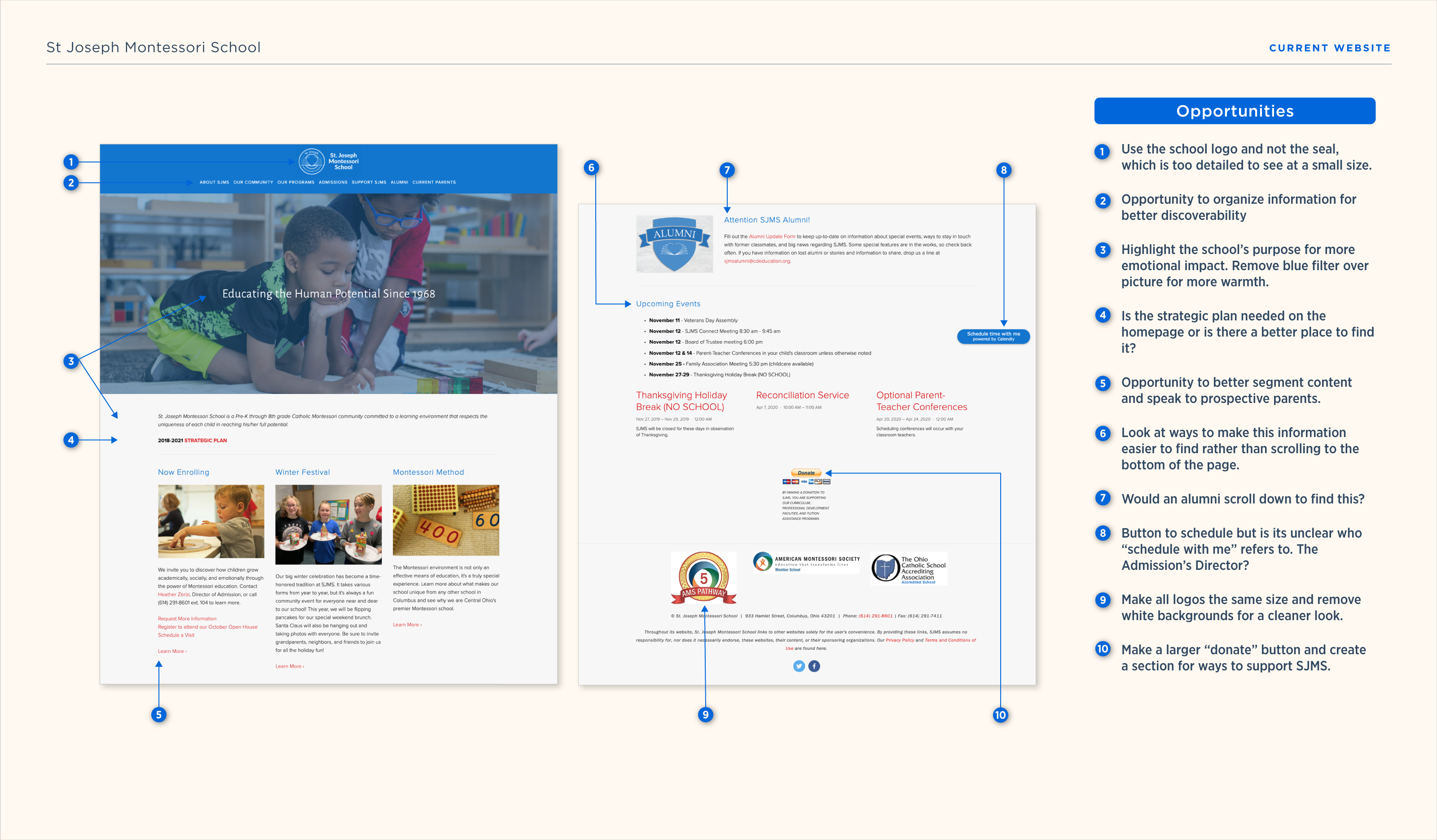
CURRENT SJMS HOMEPAGE
CURRENT SJMS HOMEPAGE
After analyzing the selected websites as well as familiarizing myself with many more Montessori school websites, I took a look at the SJMS homepage to find initial opportunities for improvement.
After analyzing the selected websites as well as familiarizing myself with many more Montessori school websites, I took a look at the SJMS homepage to find initial opportunities for improvement.
After analyzing the selected websites as well as familiarizing myself with many more Montessori school websites, I took a look at the SJMS homepage to find initial opportunities for improvement.
—
Research Synthesis
—
Research Synthesis
ARCHETYPES
ARCHETYPES
ARCHETYPES
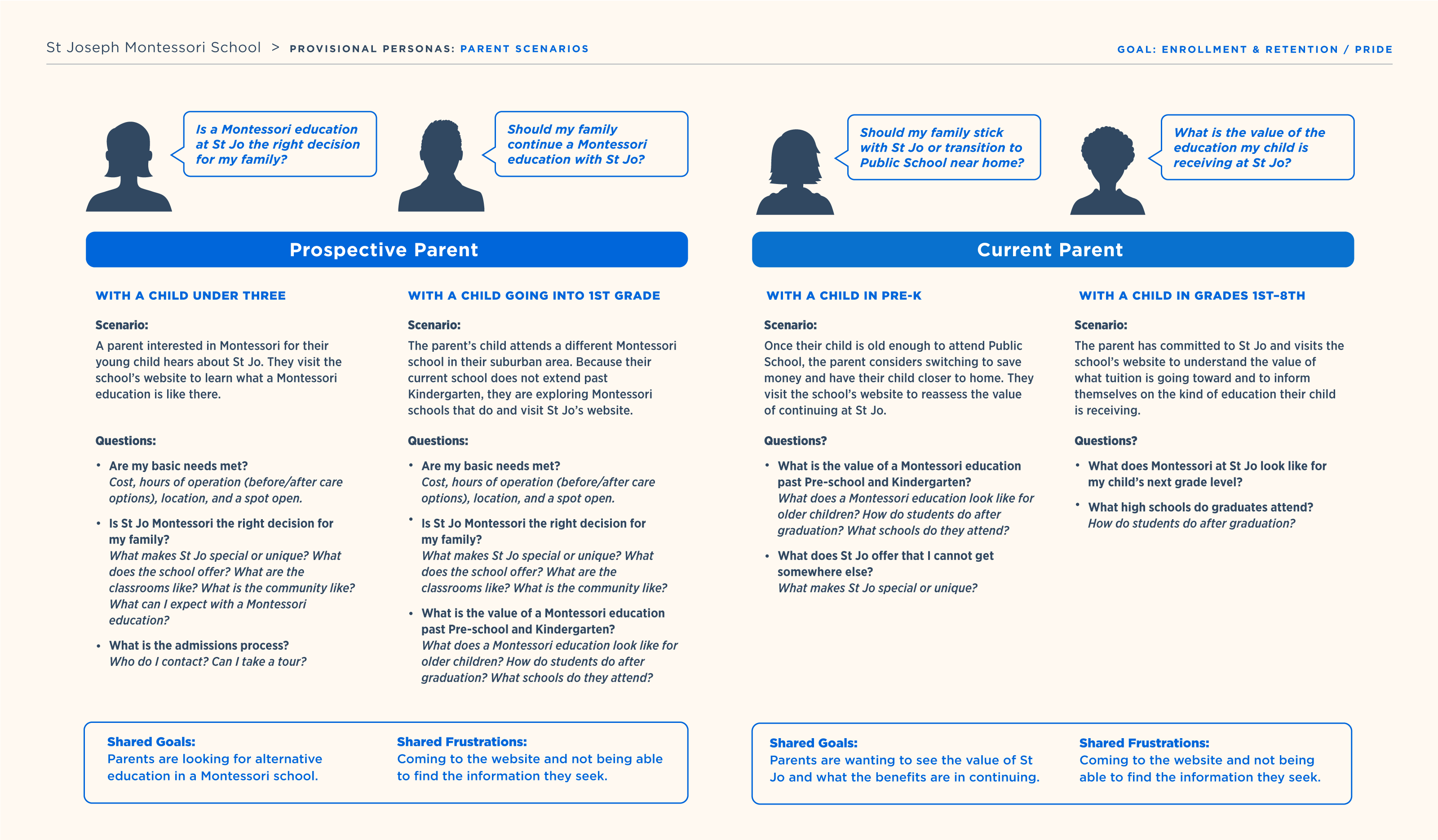
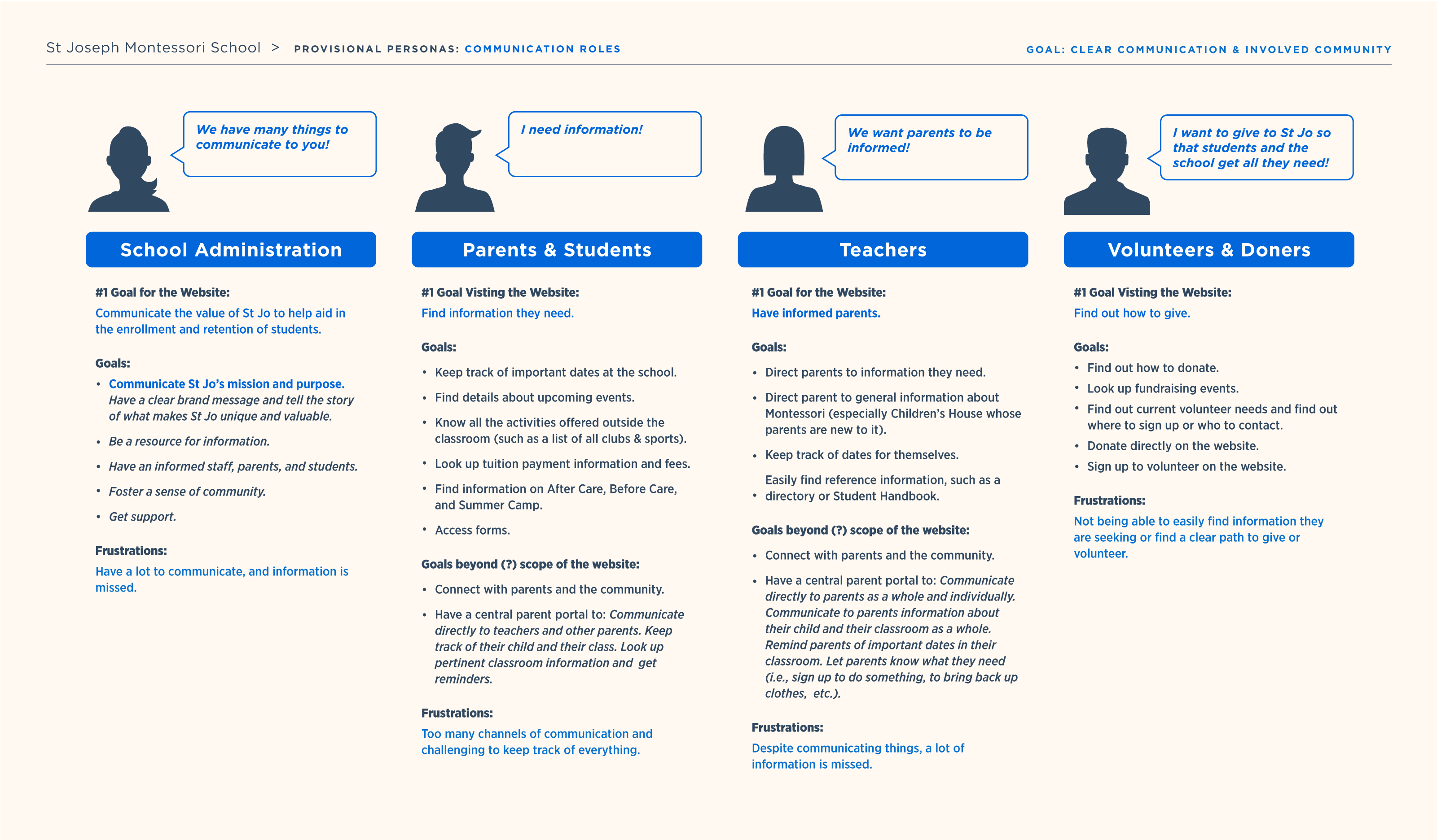
Thinking through the needs of all involved, I found that the school’s communication goals are aligned with the information being sought.
Thinking through the needs of all involved, I found that the school’s communication goals are aligned with the information being sought.
A shared goal of understanding the value of SJMS
The communication of this information aligns with the school’s primary goal to increase enrollment and retention.
A shared goal of an informed and involved community
Site visitors want to be informed of the same information the school wants to communicate, fostering the shared goal of an informed and involved community.
SOLUTIONS FOR ACCOMPLISHING GOALS
SOLUTIONS
SOLUTIONS
With shared goals, how can the website better serve everyone’s needs?
With shared goals, how can the website better serve everyone’s needs?
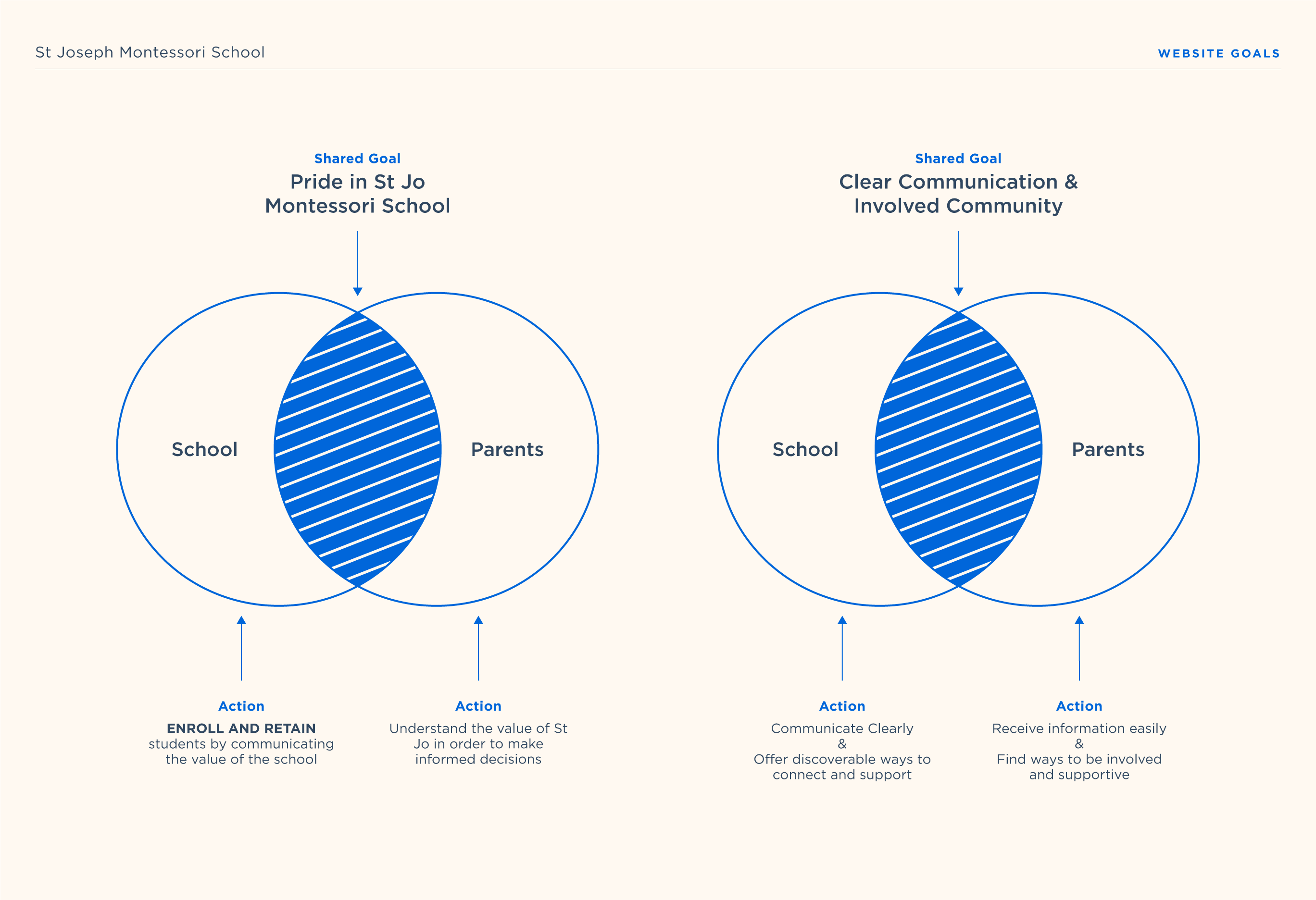
Communicating the value of the school to enroll students also retains students and creates a sense of pride.
Communicating the value of the school to enroll students also retains students and creates a sense of pride.
Communicate that SJMS provides an authentic Montessori education
There is an opportunity to clear up confusion surrounding what Montessori is. As the Head of School says, there are a lot of “Monte-sorta” schools out there.
Spell out what makes SJMS different and special
Create a focus on the St. Jo difference. Add testimonials from current and past parents/students and highlight the success of alumni.
Highlight grades and programs the school offers on the homepage
The website could highlight SJMS offers a Montessori education till eighth grade, unlike any other Montessori school in the Columbus area. After Care and Before Care from 7:00 a.m. to 6:00 p.m., a big help to working parents, that could also be played up on the website.
Getting the community involved begins with discoverable ways to connect and support the school.
Getting the community involved begins with discoverable ways to connect and support the school.
Become a central source of communication
The lengthy weekly email newsletter could potentially shorten by providing links to a central source on the website for more information. This would help the school keep track of what is being clicked on and read, showing what is of interest to parents. Also if a parent misses something in a newsletter, a parent that more regularly visits the site has the opportunity to discover previously missed information.
Make it easy for people to discover ways to support and get involved
Become a central location to sign up for volunteering, purchase tickets, and give donations. Easier visibility to what volunteers are needed has the potential to increase involvement. Highlight the different ways to donate or support on the homepage.
—
Information Architecture
—
Information Architecture
ORGANIZING CONTENT
ORGANIZING CONTENT
ORGANIZING CONTENT
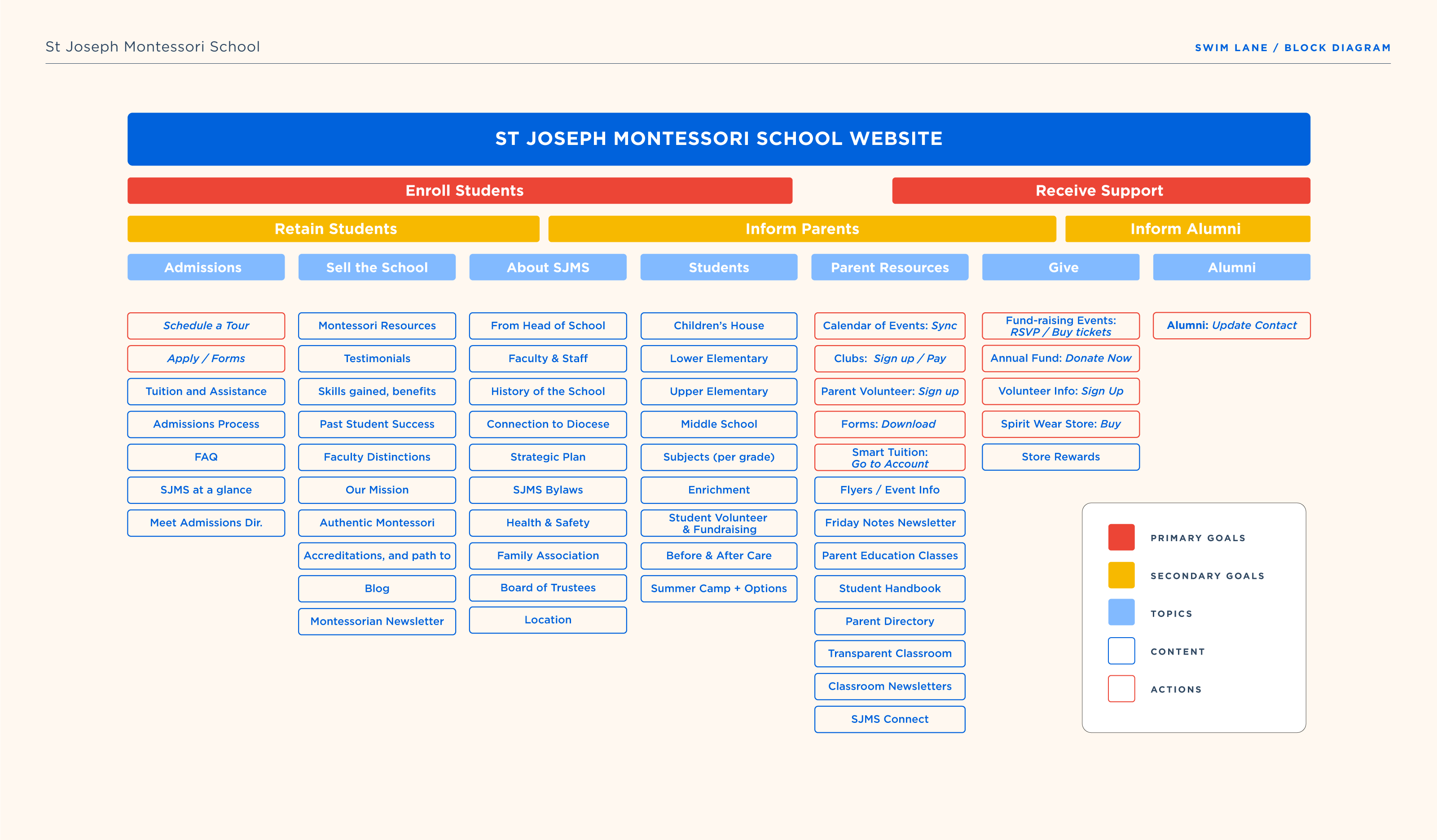
With solutions in mind, I explored the organization of content to communicate the value of SJMS and offer discoverable ways to become involved in the community.
With solutions in mind, I explored the organization of content to communicate the value of SJMS and offer discoverable ways to become involved in the community.
Goals of the website are grouped in relation to the content provided
As I worked, I put post-it notes on my office wall labeled with all sorts of topics, content, and actions that came up during my research. The graph below narrowed down the many post-it notes into a combined swim lane/block diagram, forming the groundwork for a new sitemap.
CURRENT SITEMAP
CURRENT SITEMAP
CURRENT SITEMAP
SOLUTIONS FOR THE SITEMAP
SOLUTIONS FOR THE SITEMAP
SOLUTIONS FOR THE SITEMAP
Admissions
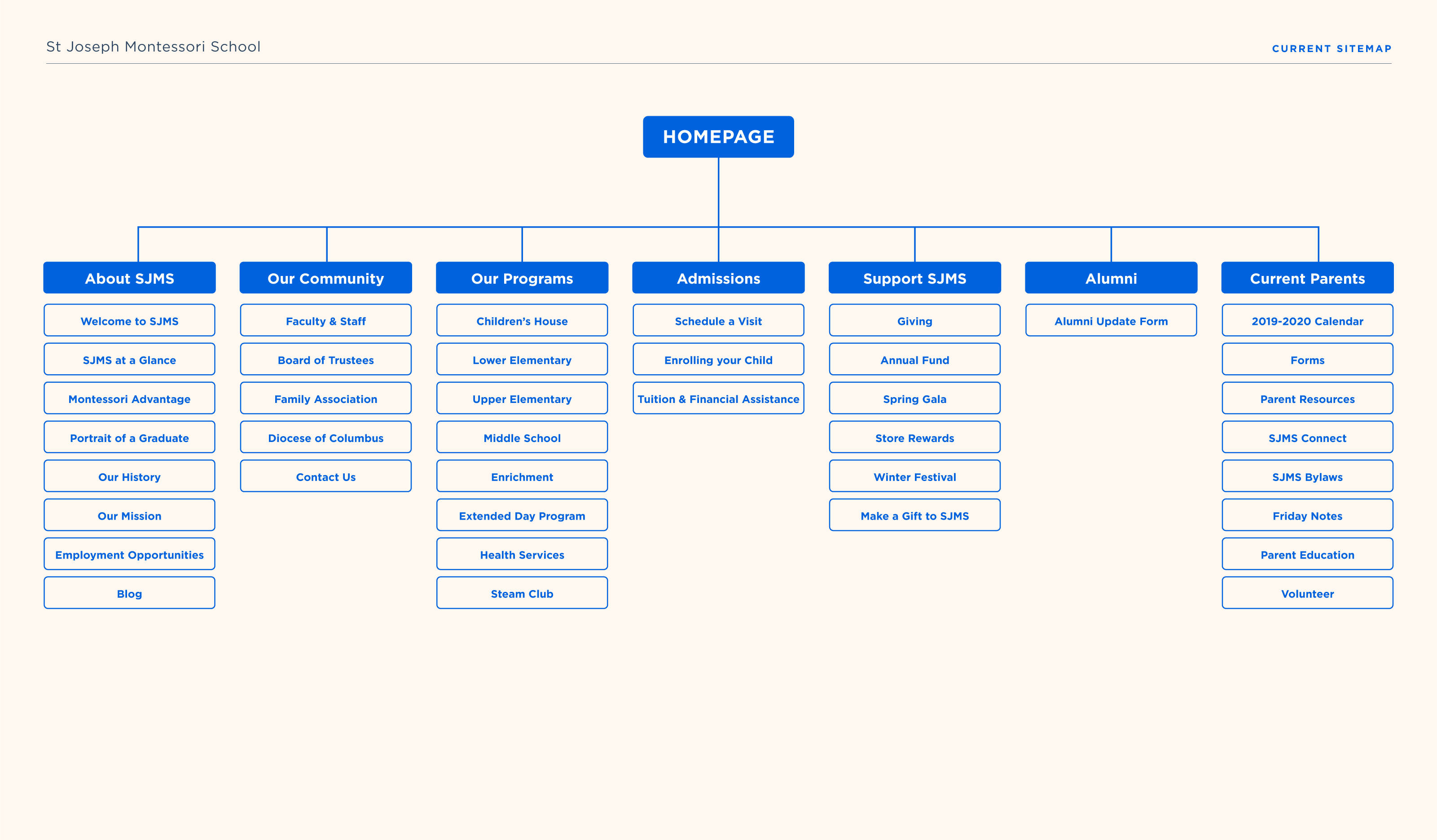
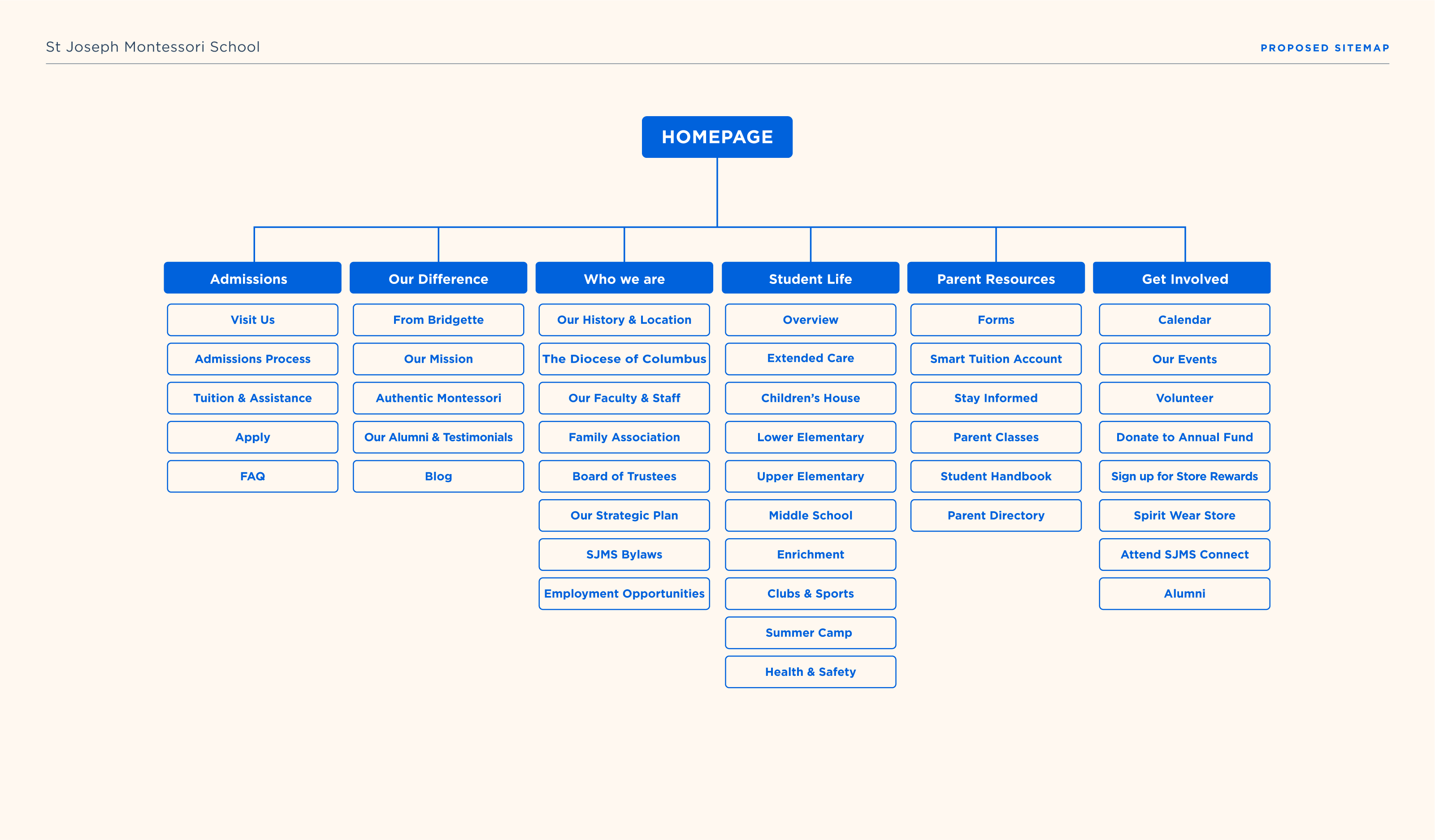
With the website’s primary goal to gain enrollment, the proposed site map puts the category “Admissions” first. The added link “Apply” gives prospective parents a clear path to action, while FAQ can answer their common questions. “Enrolling your Child” switched to a clearly laid out “Admissions Process” page.
Our Difference
A letter from the Head of School and a mission statement introduces a new category titled “Our Difference.” This category directly covers what makes SJMS special with a clear path to discover the advantages of an authentic Montessori education. The school’s blog furthers this topic with articles featuring the value of Montessori. Lastly, a link to “Alumni & Testimonials” goes to a page describing the “portrait of a graduate” and offers testimonials.
Who we are
The “Who we are” category addresses nitty-gritty topics, such as the school’s history, location, bylaws, strategic plan, as well as links to the faculty and associations that make up the St. Jo community.
Student Life
The previous category “Our Programs” became “Student Life” to describe anything to do with a child’s experience. Links to clubs and sports were added, as was a link to summer camp.
Parent Resources
This category, carried over from the previously titled “Current Parents,” has links to anything a parent might need. It is no longer limited to current parents as some forms found here are sought after by enrolling parents, too. Addressing all parents also gives visibility to what is offered, such as parent classes, which may help persuade prospective parents.
Get Involved
“Support SJMS” became “Get Involved,” a title that speaks to the shared goal between the school and parents. Links to information about events and dates are mixed with information on how to donate and volunteer, lumping these interrelated categories together. This is also where Alumni can find the information directly related to them.
—
Branding
—
Branding
BRAND ATTRIBUTES
BRAND ATTRIBUTES
BRAND ATTRIBUTES
St. Joseph Montessori School is nurturing, respectful, and curious.
St. Joseph Montessori School is nurturing, respectful, and curious.
LOGO REFRESH
LOGO REFRESH
LOGO REFRESH
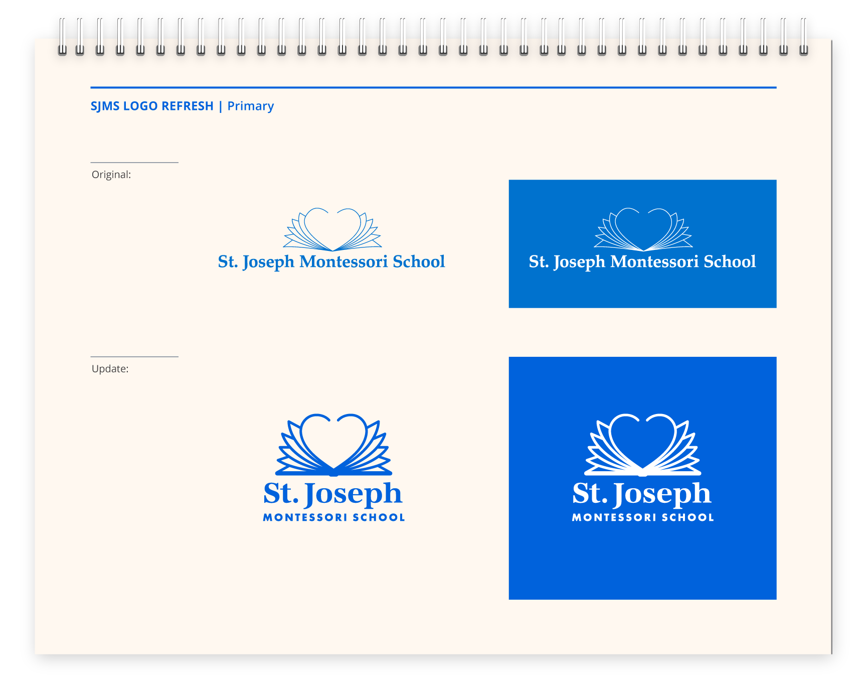
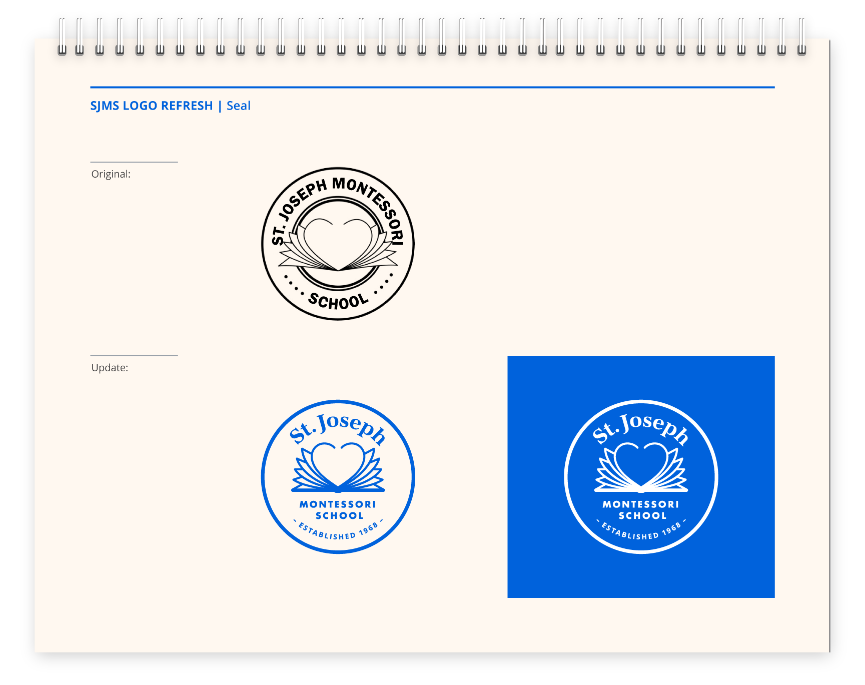
The original logo concept is kept intact, but with a refreshed update.
The original logo concept is kept intact, but with a refreshed update.
The original logo fits the school’s brand attributes
The existing logo depicts a book with its pages spreading open like wings forming the shape of a heart. The logo describes a love of learning along with the embrace of warmth and kindness, still suited to the school’s mission and image.
The updated logo is more compact and bold
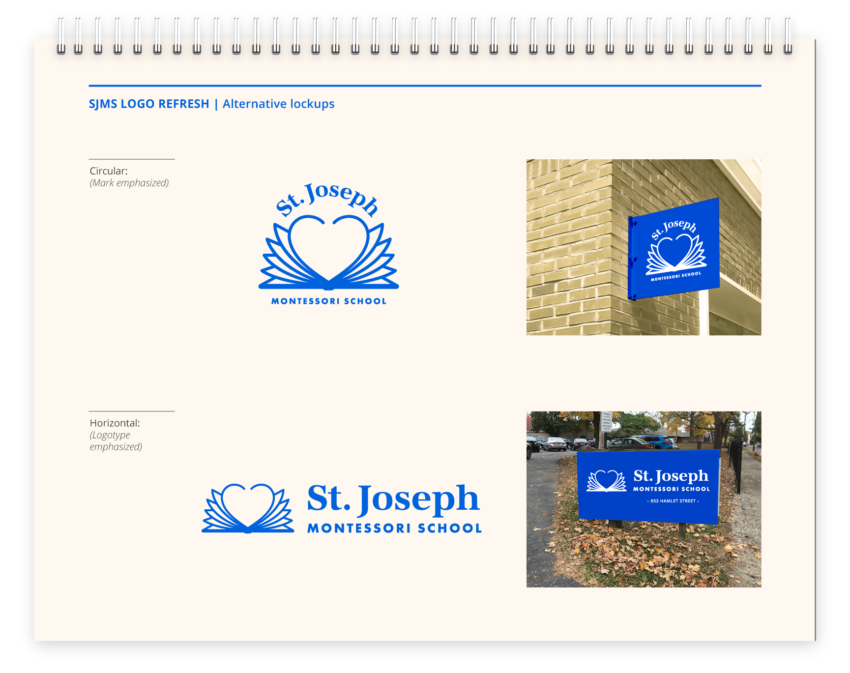
A more compact and bold logo better serves small digital spaces, printed pieces, and largescale outside signage.
COLOR PALETTE
COLOR PALETTE
COLOR PALETTE
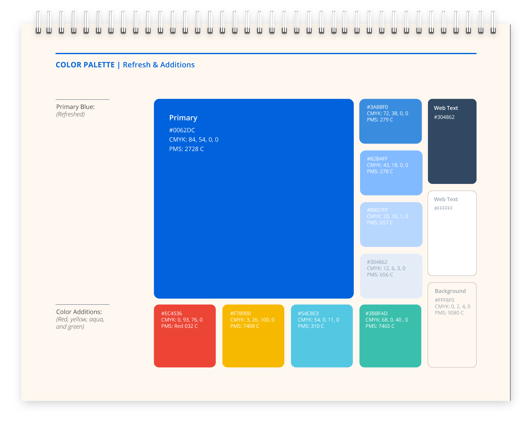
A robust color palette is inspired by the bright primary colors of Montessori materials.
A robust color palette is inspired by the bright primary colors of Montessori materials.
A more vibrant blue
The school predominately uses Pantone blue 285 as the sole color. I propose Pantone blue 2728, which is very similar but has added vibrancy and depth.
Additional colors
The new color palette offers more hues and shades of blue to mix with the brand blue and to add warmth, the website background color is cream.
MORE BRANDING ELEMENTS
MORE BRANDING ELEMENTS
MORE BRANDING ELEMENTS
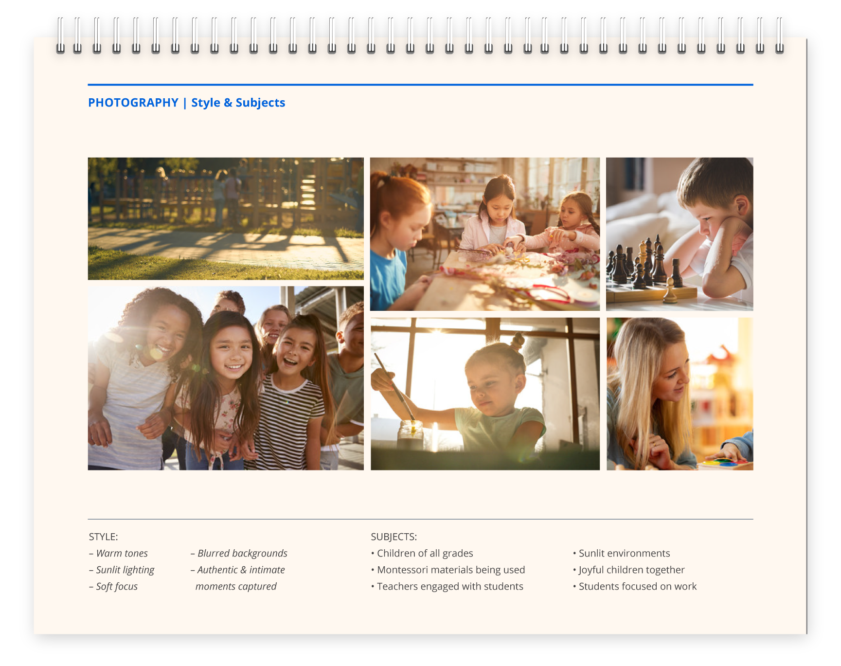
Photography style has warm tones and sunlit lighting
New photography could be shot to depict the warm and nurturing environment of the school.
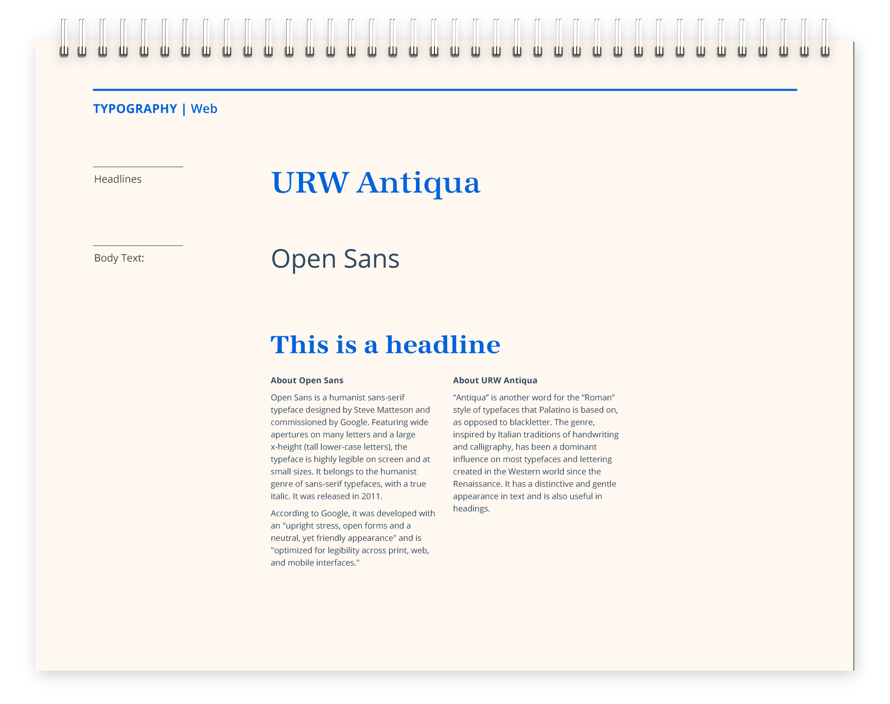
Typefaces
Free Google fonts do not require the school to invest in fonts. URW Antiqua is a Google font in the same gentle Italian genre of the school’s typeface, Book Antiqua. Open Sans is a friendly and very legible typeface for body copy.
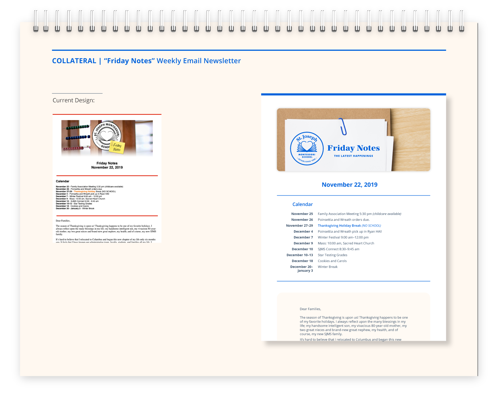
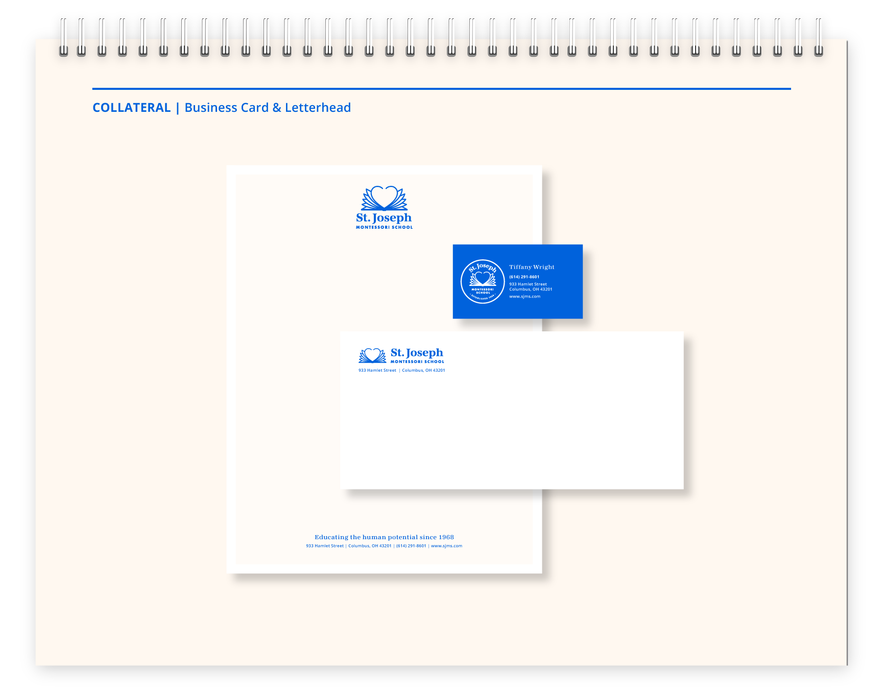
Collateral samples show the design in use
An update to the weekly newsletter, business card, and letterhead show how the refreshed logos and color palette extend into other collateral.
—
Design
—
Design
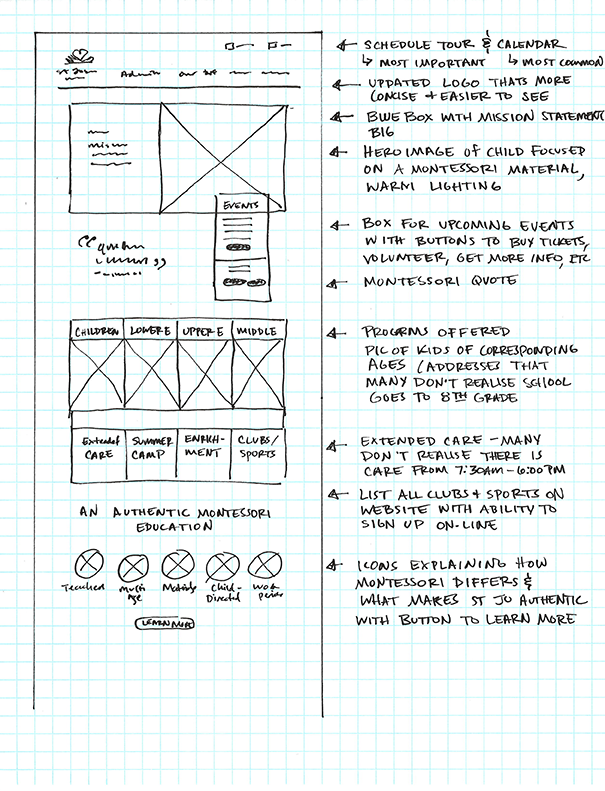
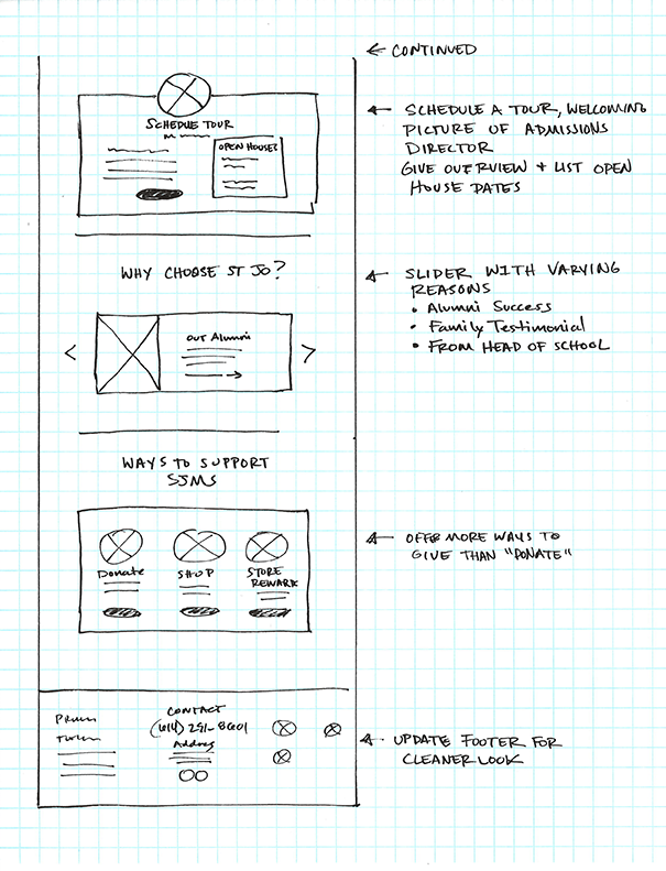
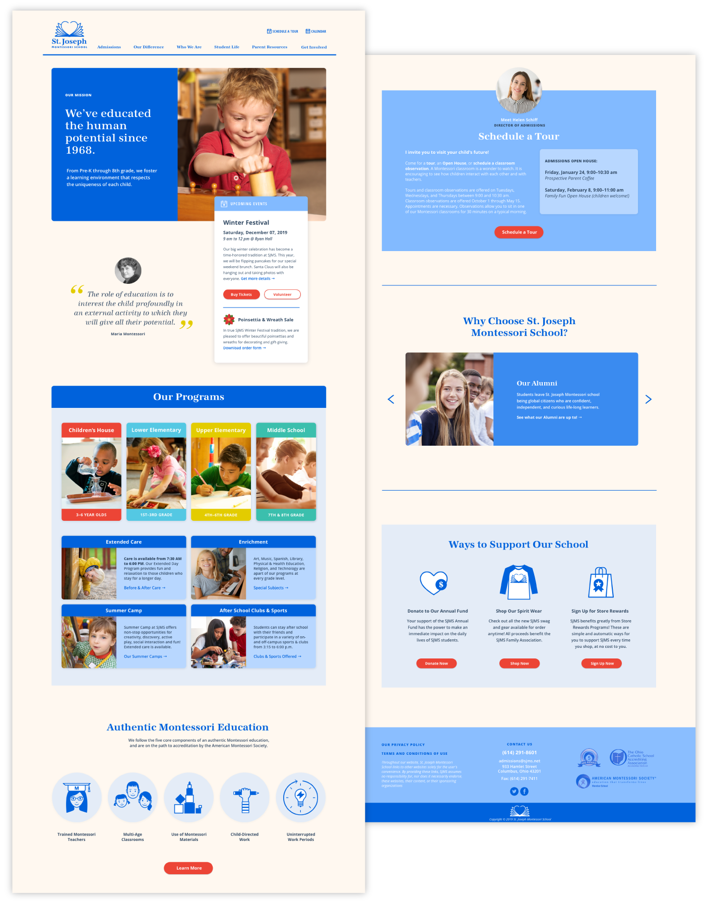
The design ensures key information is offered and discoverable from the homepage.
The design ensures key information is offered and discoverable from the homepage.
HOMEPAGE SKETCH
HOMEPAGE SKETCH
HOMEPAGE SKETCH
HOMEPAGE DESIGN
HOMEPAGE DESIGN
CATEGORY PAGES
SAMPLE PAGES FROM EACH CATEGORY
SAMPLE PAGES FROM EACH CATEGORY
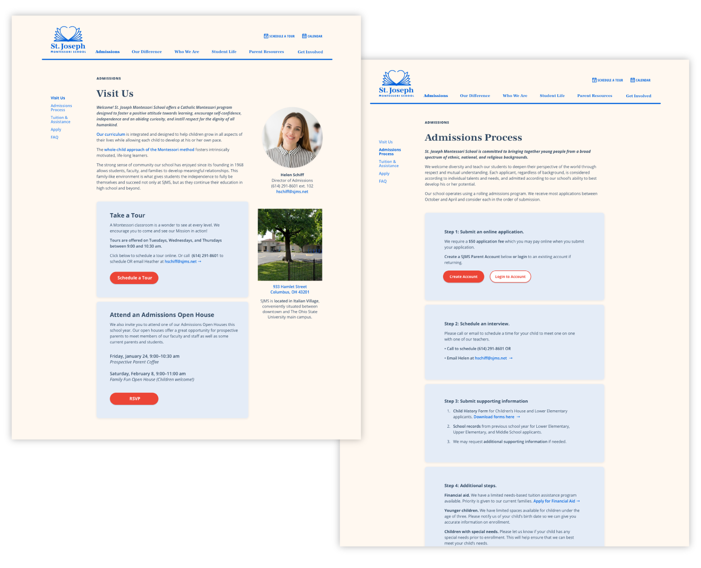
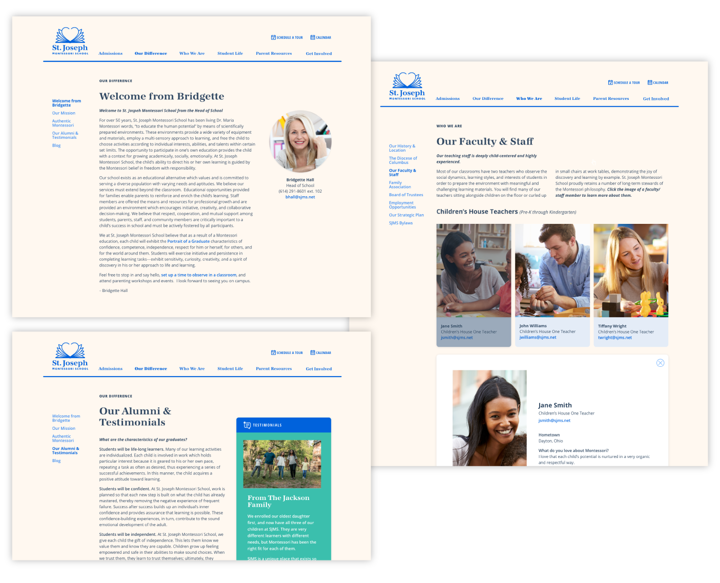
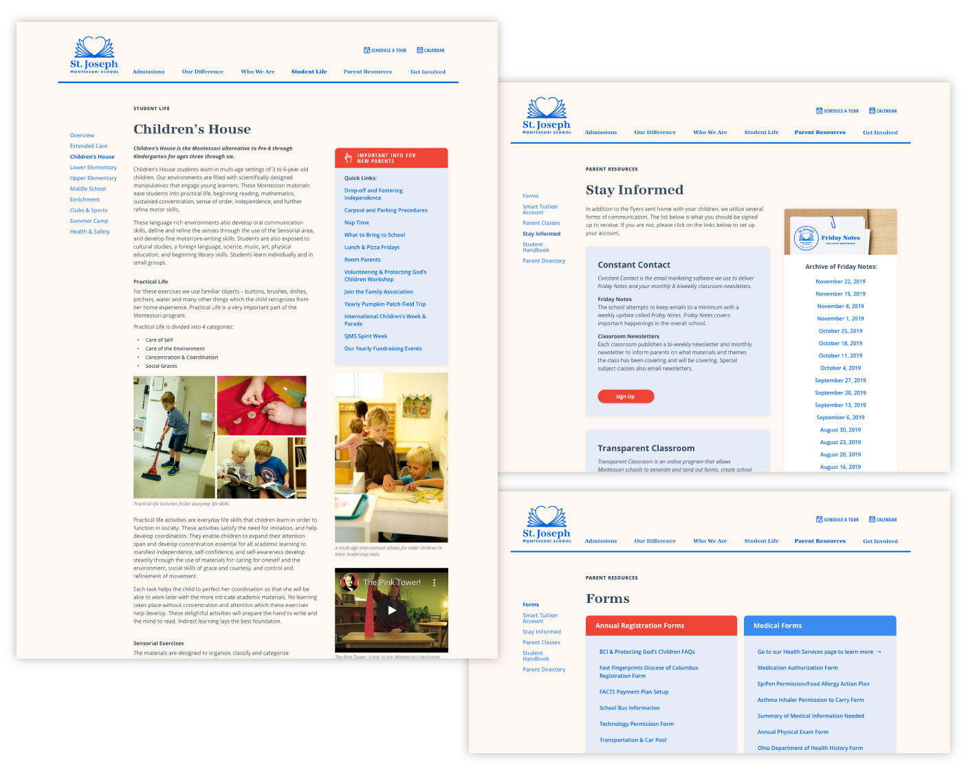
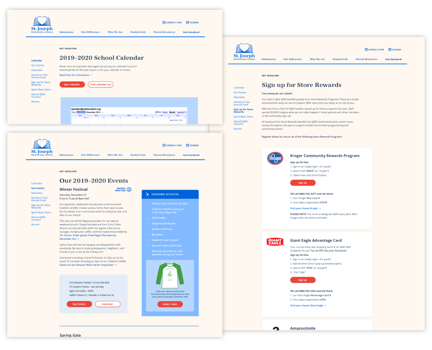
Side navigation on each page organizes related topics for easy discoverability. Other key updates are:
Side navigation on each page organizes related topics for easy discoverability.
Admissions
Scheduling a tour or visiting an open house are two clear actions and the admissions process is clearly laid out in steps, with an introduction to the Admissions Director.
Faculty & Staff
Bios introduce the faculty and staff. Photographs of them engaged with students communicate the warm and personable feel of the school.
Explaining the programs
The Children’s House program page now offers a side menu with links to common questions and information often repeated to newly enrolled families.
Parent Resources
“Stay informed” lists the forms of communication the school utilizes with links to sign up. Downloadable forms are clearly organized into groups.
Get Involved
Highly visible red buttons are used to perform actions, such as to sync calendars, volunteer, or order t-shirts.
[ Invision prototype works on desktops only ]
[ Invision prototype works on desktops only ]
Next Steps
Next Steps
“The website is very intuitive and easy to navigate. ”
“The website is very intuitive and easy to navigate. ”
Remote testing
So far ten participants have taken a remote test using the testing platform Maze. The impression has been very positive with comments like, “I liked the look and feel of the site. I was able to quickly find the information I was looking for. I think it does provide the content I would look for as a prospective parent.”
More testing needed
However, a more robust in-person test of the website prototype is needed. Also, the school recently sent out a survey to gather more information on the current website and communication. The results will help determine the next steps.
Coming soon:
GOOGLE MAPS FEATURE
YARD COMMUNITY APP
© 2020 ELIZABETH LINDE